Note for the confused: in the “opt in” link above you have to substitute your own user name. 
This is happening consistently for me…no header at the top and when I click the space where it should be, I don’t get the functionality of jumping up to the topic lists like I do in the regular theme.
I haven’t used this as intended in the bright lights, so it’s kind of wacking me out in regular light.
I’ll switch to it outside sometime and see how it feels.
I think that’s a result of the logo replacement technique. There may be a better method; I’ll see if I can fix it Wednesday night. shrug
Browsers I’ve tested with are Chrome (Android) and Firefox 55(Windows).
EDIT:
Alright, I think the new method will work best. Using JavaScript to change the image SRC for the logo.
Slapped into the </head>
section
[code][/code]
yes, yes, I know, abusing onscroll. it’s not like it doesn’t do that already.
That’s Chrome FYI.
New images pushed - a thin line has been added (barely visible) and a higher-res version of the E orb has replaced the existing one. These changes should roll out in the next few minutes.
EDIT:
Changed the code to be a little more maintainable.
I do like the E, but the line is invisible on my Android. Maybe a heavier weight?
Bug:
I’m noticing a lot of lag on mobile, to the point I had to switch off it (which is a shame, because I like the colour scheme).
FF for Android, about all I’m running is uBlock origin and HTTPS everywhere. The lag isn’t there with the default version.
Ah. The JavaScript code runs with onscroll events. Short of hard-forking the Discourse codebase I couldn’t find any other method. Pity.
Replying to note that we’ve rolled out mute features to this theme, using code from this repo:
Limitations:
- stored as localstorage - mutes don’t carry across device
- doesn’t hide poster name (will fix soon)
https://bbs.elsewhere.cafe/t/upcoming-feature-addition-hide-post-by-user/903?u=tinoesroho
Bumping to note the change to svg logos! (These scale nicely and save us a lot of bandwidth - down to 2.06kb from 4.86kb, a reduction of 42%).
I suspect something went… Hinky with the CSS. Probably some nonsense to do with post images being set to 100% width. Was able to replicate issue, will fix in morning.
EDIT:
Fixed. (Turns out I’d set all images to scale, rather than pixel widths, so I added a new rule to exclude avatars)
Can I suggest æthertones as the next theme? 
I imagine it would end up looking like a lighter shade of default dark (to distinguish from a future aquatone)… 
Patch Notes - 30 November 2017
Mobile
- increased Edit glyph priority
should be always visible now - ems everywhere, rather than fixed-pixel sizes
avatars should now scale nicely to DPI
Common
- Rolled out the PNG-based Mute Script update
viewable, even with webfonts disabled
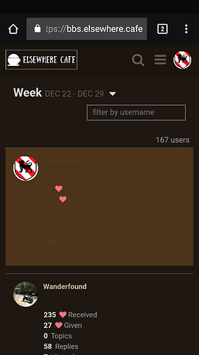
I went into the Users page to see if I was anywhere near making Regular, and this is damn near impossible to read:
Acknowledged. Will have it fixed Sunday. I apologize for not catching it sooner.
No worries. I’m probably one of the few people who bothers checking that page, so it’s not surprising that it went unnoticed for so long.
Fix rolled out, sorry for the wait.
Patch Notes -- 23 June 2019
– Increased contrast of elements for easier use outdoors and on TFT LCD panels.
FWIW I’ve been rolling my own theme for the whole internet with the Midnight Lizard browser extension

