Except for dyslexics. It works surprisingly well for quite a number of them, because the similar letters (e.g., “b”, “d”) have somewhat different characteristics. I’d have to concur with @MarjaE on this one - when I use Notepad for drafting papers, etc., I use Comic Sans because it is much easier to read than most of the other fonts - and I’m not dyslexic, I’m presbyopic.
5 Likes
While all of this is true… in this context, we’re talking about the lawyer of the President of the United States making an official statement for that President.
I’m sure they could come up with an easy-to-read font that would look a little more… official?
5 Likes
He wouldn’t be the lawyer of the current POTUS then, now, would he?
2 Likes
It might be interesting to do a poll on which fonts people find readable. For me, mainstream sans-serif and serif fonts tend to blur together into gray worms, and it’s hard to read the worms.
1 Like
It was good enough to announce the discovery of the Higgs.
Though I’m not dyslexic, I would agree. There’s a lot of pretentiousness around typefaces, but they were originally designed to work with metal type. There’s nothing natural about our standards. If anything, comic sans is closer to monastic minuscule than moveable typefaces.
2 Likes
The most legible typeface I’ve ever come across is Sassoon Primary. I’ve tested it at some very small sizes, and it’s much easier to read than anything else I can find.
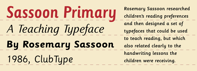
Similar in theme to Comic Sans, but much more tasteful.
13 Likes
11 Likes
Oh, that’s a gorgeous set of letterforms. It’s got a lot of character but yes, very clear and looks nice at loads of different sizes, judging from that sample.
5 Likes
I agree, it is nice. I note that it relates to handwriting with modern pens and pencils.
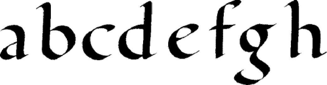
Carolingian minuscule looks the way it does because of quill pens, but that allowed for, note how similar are the b,c,d,e.
We’re off Trump, unless a teaching typeface would be better for tiny hands.
5 Likes
look at the intricate pixelation and anti-aliasing artifacts. All done by hand. The monks must have gone blind carefully refining each letter.
back to Trump?

5 Likes
Literally anything that people can employ to make themselves feel superior to others, they’ll employ.
5 Likes
Could it be a subtle form of opposition, by the assistant who typed it in, at least?
6 Likes
Could be. I feel kind of sorry for any assistants who have to work there.
4 Likes
The animation in that makes the logo look more like masturbation than it already does.
2 Likes
5 Likes
3 Likes
While this is a problem, I’m pretty sure the context there is criminality under local U.S. laws, which the current administration is currently running afoul of. Lower bar, and (should be) easier for an administration to stay on the right side of…
3 Likes
Yeah, I’m just being snarky.
Liberals waxing poetic about Obama’s “scandal free” administration and being mocked in return by globally-aware leftists has been a recurring theme on Twitter over the last few weeks.
3 Likes
I’ll cop to it being a bit selfish, but as someone who had no problem with calling out Obama’s issues, I’ve still got a fairly strong opinion of which kind of scandals I’d prefer the U.S. to be dealing with right now… especially since global political scandals have slightly less dependency on the U.S. government’s makeup to determine whether consequences happen.
4 Likes