The candelabra looks a little out of place, but pretty great overall.
6 Likes
15 Likes
11 Likes
This museum always struggled for attention in Stockwell and effectively closed in the early 2000’s but a visit was always instructive, the custodians were so enthusiastic and keen to share the decades/centuries of learning.
13 Likes

11 Likes
14 Likes
Here’s an interesting article about Zohran Mamdani’s campaign posters, why they don’t look like typical US campaign posters, and the ideas behind the design choices:
14 Likes
Is this the one case where the thumbnail arrow actually makes sense?
12 Likes
Yes
11 Likes
13 Likes
Foid.
11 Likes
![]()
12 Likes
That is a very nice logo! If you ask me, Ford should have gone with it.
9 Likes
Fnord:

9 Likes
Which one though …
6 Likes
The first one, the prettiest one, with the pretty lady.
She’s Carmen Miranda-esque.
6 Likes
5 Likes
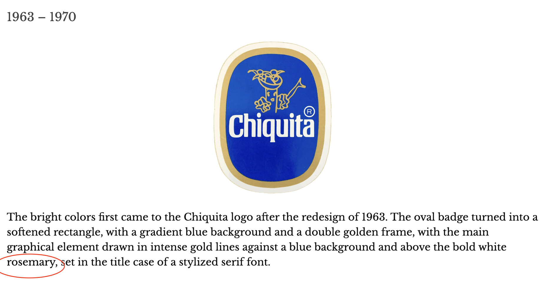
I wondered about that, too. A bit of poking around online suggests that it’s a logo containing the brand name, but I couldn’t find any real source for that. The herb has a reputation for improving memory, and it’s often used as a symbol for remembrance, so maybe the name was borrowed by the logo design community and used for logos that remind you of the company/brand (vs. abstract logos)?
Or, you know, it’s something completely different. ![]()
7 Likes
I think it’s just some AI hallucination.
I had done some poking around too… I was willing to imagine that “rosemary” might be some insider logo-design jargon, but I couldn’t find anything to support that guess. Only some stuff about the symbolism of the plant rosemary, and why the plant might be used in a logo design.
Best connection I found is that in the 1921 film The Last Trail, a character named Chiquita is played by a woman named Rosemary Theby. That’s good enough for AI, right?
7 Likes