Here’s an interesting article about Zohran Mamdani’s campaign posters, why they don’t look like typical US campaign posters, and the ideas behind the design choices:
Is this the one case where the thumbnail arrow actually makes sense?
Yes
Foid.
That is a very nice logo! If you ask me, Ford should have gone with it.
Which one though …
The first one, the prettiest one, with the pretty lady.
She’s Carmen Miranda-esque.
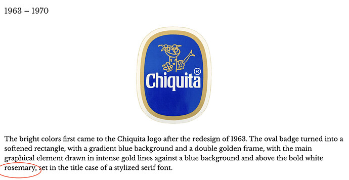
I wondered about that, too. A bit of poking around online suggests that it’s a logo containing the brand name, but I couldn’t find any real source for that. The herb has a reputation for improving memory, and it’s often used as a symbol for remembrance, so maybe the name was borrowed by the logo design community and used for logos that remind you of the company/brand (vs. abstract logos)?
Or, you know, it’s something completely different. ![]()
I think it’s just some AI hallucination.
I had done some poking around too… I was willing to imagine that “rosemary” might be some insider logo-design jargon, but I couldn’t find anything to support that guess. Only some stuff about the symbolism of the plant rosemary, and why the plant might be used in a logo design.
Best connection I found is that in the 1921 film The Last Trail, a character named Chiquita is played by a woman named Rosemary Theby. That’s good enough for AI, right?
More than good enough. Heck, blue and gold are the colors of the Cub Scouts in the US, so even that could figure in. Somehow. Maybe.
The other thing that I thought of was the “registered trademark” symbol (R) by the brand name, that maybe it was autocorrected into “rosemary” somehow. That makes even less sense than our other theories, though.
They’re the colors of my high school! ![]() (it’s been a while…)
(it’s been a while…)
Whenever I see the color combination used by my BF’s alma mater and current employer, I yell, “Go Warriors!” and he cracks TF up ![]()
Just for the record, I feel compellled to state that the the mascot of my high school was not a banana.


