Every now and then you do get something thoroughly redesigned to make it smooth. With the horrible trend of interfaceless design, though, it usually just means that now you don’t know how to use any part of it. Sure, having things work like magic sounds nice, but really, there’s a reason wizards have to spend years studying – far better to have your controls work like controls.
9 Likes
- “We don’t want people to have to deal with too many preferences.”
That’s a good reason to redesign your preferences. But not to neglect a front end for accessibility preferences which already have a back end.
- “We already have full page zoom, and that that’s standard, so why would we need minimum font sizes. Users can use the handy toolbar for full-page zoom, or go through 2 layers of preferences for minimum font sizes if they really prefer a non-standard option.”
Full page zoom is absolutely shitty. Minimum font sizes makes standard print big enough to read, without making headers too big to fit anywhere.
When add-ons are inadequate solutions, either because of bugs in the add-on, code that excludes Mozilla’s own pages, or only applying add-ons after rendering pages, causing a flash as it re-renders:
-
“We already have a popular ad-on for that, why should we code a preference for it?”
-
“Sorry, we don’t do support for add-ons. Closed as invalid.”
When user css is an inadequate solution, such as because the tab throbber loads before css to protect against the migraine-inducing tab throbber:
-
“We have a user css fix”
-
“Sorry, we don’t do support for user css. Closed as invalid.”
5 Likes
Thinking this over:
-
There’s a lot of inertia, but it prevents at least as much harm as it causes. Inertia and backwards compatibility mean there’s more time to address bugs and develop fixes and keep those fixes working.
-
Some apps such as Preview and Scrivener don’t ask before saving, because it’s archaic and unnecessary.
-
Preview wasn’t/isn’t compatible with my scrolling software, and would/will take mouse slips as some kind of edits. So save-on-quit ends up corrupting files.
-
Scrivener has a lot of confusing options. Now the usual advice for word processing and other writing software is to learn through experiment and no no no you’re supposed to use these things when you set up how did you not learn to use these things? okay, where do I begin? just through experiment… And if you screw up and can’t revert, and need to quite and reload the last good version, then save-on-quit destroys the last good version.
-
I think the cult of the new shiny shinyyy is more of a problem.
-
I think the cult of the wordsforme is also a problem. You end up with uneven development.
-
Because some programmers don’t use scrollbars, and think everyone can use touchpad gestures or tendon-rippers instead, there’s a push to hide scrollbars or narrow them so they can’t be used for scrolling.
-
Because some programmers are satisfied with a touchpad hack that treats a had hivering an inch above as a series of single and double clicks with a standard PS/2 mouse, that touchpad gets Ubuntu-certified.
-
Wish accessibility were considered new enough and exciting enough to actually sort out more problems.
4 Likes
In 2006, A List Apart published the popular article In Search of the Holy Grail, which outlined a detailed and thorough approach to creating what was known as the Holy Grail layout — a header, three columns and a footer. It’s pretty crazy to think that what sounds like a fairly straightforward layout would be referred to as the Holy Grail, but that was indeed how hard it was to create consistent layout at the time using pure CSS.
Why? Isn’t the point of print to make things readable? Isn’t the multi-column layout a concession to technical limitations of using paper pages? Doesn’t copying a harder-to-read layout leave you with a harder-to-read layout? This is why some browsers contain unreliable tools to try to get things back into an easiet-to-read layout!
This is nice
This is NOT nice! This isn’t up to the level of “This is fine,” but it is still denial.
2 Likes
I can’t reply in Medium because of the text jitter. But fuck.
2 Likes
I’d be happy to see an astounding, years-in-the-making, complete overhaul of the Photoshop UI led by a UI design genius, because yes, a lot of it is obtuse.
I have to look up how to draw a line every time, and frankly half the time even after looking it up I can’t figure out how to do it. (To be fair, I use it professionally in a couple different contexts but drawing lines in it is not something I normally need to do.)
However, it’s extraordinarily versatile because in this day and age it’s an unusually open toolbox - nothing dumbed down (like Final Cut X), although a lot of it is black-boxed. It’s essentially every possible image tool thrown together in a box, and like with a real-life tool box, it’s up to you to know what to do with what’s in it with very little guidance. And like a real tool box, if you know what you’re doing you can do practically anything with the things in it (even some things that aren’t image-based if one is imaginative enough). There are no practical alternatives for a huge percentage of things it’s used for professionally (and yes, it is often used as a cure-all kludge where a more specific tool would be better, but doesn’t exist).
I think there is room for a redesign without taking away that it’s a box of tools that you can use together to do anything you want with. It is already actually intuitive to use different tools together to get the result you want - with practice - but the learning curve to reach that point could be dramatically lessened with a good redesign.
In other words, I actually think the UI is quite good. One only has to look at the alternatives (like GIMP) to realize that. It certainly isn’t easy to use, but that’s because image manipulation itself is hard. There are really very few areas where the Photoshop UI gets in the way and makes things harder than they should be.
One thing that could use a lot of improvement is documentation - there are endless features and functions where you don’t really know what they’re doing at the technical level, and there’s no way to find out. This kind of stuff can be really important for technical and scientific uses of Photoshop, including what I do at Stanford, which is working on digitization of library materials (so there are a lot of long-term-archival concerns).
7 Likes
Anyway that was a ramble but the UI thing that drives me crazy is when things move between the time I decide to click on something and when my finger hits the screen. It used to happen a lot on the computer too, but things there have generally sped up enough that it’s not a huge issue. On the phone, my reaction time is a lot faster and it takes less time to click where you want, so even a very small delay in something loading can be a problem.
The thing is that after it happens a couple times, or like for me it happens multiple times a day, it’s really obvious what the solutions are (depending on the specific place where it happens). All the years I used Nexus phones I always heard and read that the iPhone interface was better and more intuitive. I switched to an iPhone X about a year ago (not specifically for UI reasons) and after getting properly used to it, I am continually shocked at how many interface quirks and outright broken elements (in third-party apps) there are. I mean I’d still choose it over Android (though I like a lot about Android) but it’s honestly pretty bad in some fundamental ways, and the solutions often seem obvious - they’re not technical issues, they’re design issues.
4 Likes
This is why I hate photoshop. Even the most basic functions that every other image editor existing make simple and obvious require hours of study to figure out in photoshop - if you’re lucky.
I used to have a designer give me photoshop files that had tons of images spread across multiple layers and had to spend hours trying to merge and slice them to get the images we needed out of photoshop. I stopped accepting photoshop files from that designer and just started requiring the actual final images, individually, in png format.
Then one time I had to draw a rectangle. After a couple of hours of study and confusion, I instead decided to just flatten and export the image to a normal image format, draw a rectangle in a more well-designed image-editor, and then just reimport that image as a layer on top of everything else. At least that was relatively easy.
7 Likes
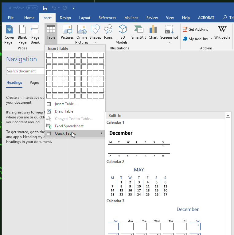
I’ve been doing a ton of documentation at work lately (in MS Word) and I really like the Automatic Table of Contents feature. But I can’t find where to go to manually add it. So every time I click on help, type “Table of contents” and what I need pops up, but…just tell me where it is.
It does remind me of a presentation on some new version of Office that was being unveiled. The spokesperson noted that over 50% of the feature requests they saw were already in the product and users couldn’t find them.
10 Likes
The lack of good manuals in the last 20 years has really annoyed me. Now we have to go to the “community” to ask questions, which neatly relieves the manufacturer from putting in the work (and $$$). Grrr.
9 Likes
Fancy backgrounds for vector pdfs. They make the text hard to read, they move about between different devices, they get darker when converting for Kindle, they seem to be impossible to remove without fancy tools…
2 Likes
I can strip all images from pdfs using Ghostscript and an automator application:
Application recieves files and folders as input
Run shell script
Shell: /bin/bash
Pass Input: as arguments
for f in “$@”
do
suffix="-textonly.pdf"
base=basename "$f" .pdf
outputfile=$base$suffix
/usr/local/bin/gs -sDEVICE=pdfwrite -dFILTERIMAGE -dCompatibilityLevel=1.4 -sstdout=%sstderr -dPDFSETTINGS=/screen -dNOPAUSE -dQUIET -dBATCH -sOutputFile="$outputfile" “$f”
done
I can’t recall whether Ghostscript came be default, or if I installed it using Brew, or something else… Not being able to track installations is a headache.
P.S. Unfortunately, this isn’t enough to get rid of the gray boxes, and it also gets rid of pages of perfectly good text.
3 Likes
OMG that is the worst.
6 Likes
Amusingly enough, this is something I remember from high school that hasn’t changed even across platforms (I learned Word on Windows in the 90s and just checked using Word 2016 on a Mac):
Insert->Index and Tables…->Table of Contents
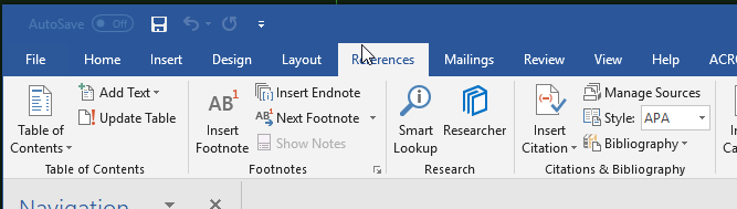
The latter hop being a tab in a window now instead of a separate menu item, but I guess sometime in the last 20 years someone at Microsoft UI Design figured that triple nested menu items are bad. Of course Microsoft’s UI Design Team also figured that making everything redundantly accessible with this Ribbon thing is a good idea (References tab, leftmost button… how’s that intuitive?).
6 Likes
Sorry if I wasn’t clear. I was referring to Insert in the top menu. If you use the ribbon, you use the References tab (it should be the leftmost button).
2 Likes
Ahh, yes there it be…
Thank you
(And people don’t use the ribbon? < GASP > )
4 Likes
I’m an oldster so I still use menus and keyboard shortcuts. Don’t quite understand why they want us to use the ribbon when there are perfectly functional menus…
10 Likes
Agree – I can’t stand the ribbon business. I used MS Office at work, and it took me a lot longer to find anything, even after using it for a good while. Now I use LibreOffice at home and it’s a lot easier.
7 Likes
I’m very mixed in the ribbon. On the one hand it’s a really good user interface for exposing a lot of functionality in an easy to discover and visualize way. I’ve written some ribbon-based UIs and have found that when compared to the old menu based system it was much faster and easier to use for typical users.
I think the problem with Office is that there’s just so much damn stuff to cram in you really can’t win - either way it’s hard to find the feature you are looking for. One nice thing about the Office ribbon is that it’s very customizable for the end user but who wants to deal with that?
6 Likes