
Ugh… Now that’s one sloppy job.
On the other hand, I sometimes threaten people with “I’ll make sure the writing on your headstone will be done in Comic Sans.” Adding “And with really bad keming.” would be a nice escalation.
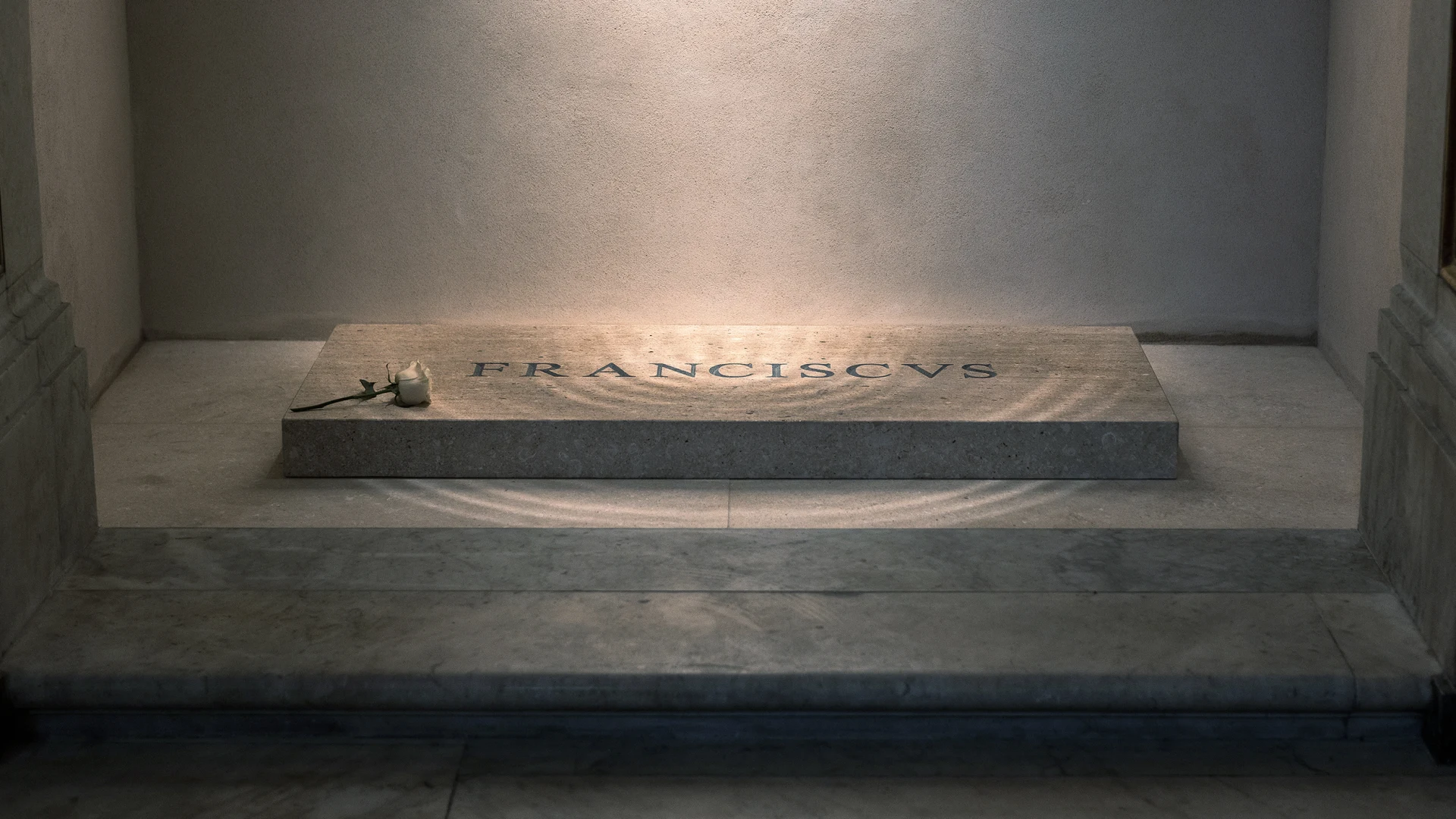
But atop that marble is a tomb inscribed with the name “Franciscus.” Or what—due to terrible spacing between letters, known as kerning—reads something more like “F R A NCIS VS.”
“An article about typography, we should proof read this carefully”
“Nah”
It’s even worse
while also pointing out that the inscription was set in Times New Roman and then carved.
They could have at least chosen Trajan, or one of the other display faces based on Roman epigraphy, rather than a newspaper typeface
In the grand scheme of things, the kerning on Francis’s tomb may not be of much consequence, as it does little to mar the legacy he leaves behind. And indeed, for a pope famous for his humility, perhaps there is no greater immortalization of that virtue than his name being chiseled so poorly in stone for the rest of time.
That’s true, but unless he chose it himself (which is entirely possible), it speaks not of his humility but of the lack of respect and care for his legacy by those that survived him
I mean… the idea is brilliant - but that’s just not how you format a list…
Or from an Argentine foundry (Sudtipos comes to mind).
I do wonder whether this is machine engraved rather than the work of an experienced memorial mason, which is, I suppose, in keeping with his reputation for frugal living.
You’re right! Argentina is a surprisingly big player in the field after all. I’m a big fan of Pampa Type Foundry and of Huerta Tipografíca myself
I wondered that as well, but even Word does a better job kerning than that these days.
Then again, whatever antiquated CAD software they may have used maybe doesn’t.
Yes, but anyone who cares can easily work around that. If needs be, by placing every letter separately. I did this in the 1980ies when I wanted building plans look good for presentations.
Well, there’s your problem


Holy sweet god almighty

My favorite comment on Reddit -
they just left room for jesus
![]()

“The history of typefaces is the history of forgeries.”
The Font Forging Industry
Forgery, Cloning, Piracy, Plagiarism of Fonts
Documentations for Prosecutors and Criminal CourtsPlease Note: This old website is no longer updated.
Most documents were written in the years 2004-2008.
It’s SO funny!!
YOU WOULDN’T DOWNLOAD A CAR