Under what circumstances is it more cromulenter to use “font,” and when is “face” preferred?
6 Likes
The cromulence is that a typeface describes a family of fonts
Typeface – Helvetica
Fonts (within the typeface) – Helvetica Roman (Regular); Helvetica Italic; Helvetica Bold; Helvetica Bold Italic &c.
Fonts also describe sizes, Helvetica Roman 12pt is a different font to Helvetica Roman 11pt – but this is (almost) archaic, relating to hand-setting when you kept the metal sorts in individual trays. And woe betide you if they were mixed up.
TBH the difference is only appreciated by typophiles, using either typeface/face and font is common and nobody but the most punctilious will raise their hackles.
13 Likes
Mind your p’s and q’s!
12 Likes
And mind your feet, those trays are heavy!
13 Likes
Thank you! I shall avoid those who are punctilious fontwise!
8 Likes
13 Likes
12 Likes

(Full disclosure: I stole this link from Rob at TOP.)
8 Likes
I’m way more interested in your post since it crucially mentions Towa Tei (of Dee Lite fame,) than the TOP post, which only mentions Minogue and her early career in a soap opera; which is about as boring as it sounds. Tei, on the other hand, is the man.
edit: Tei (Japanese) commissions a japanese designer to create a font for his album, and gets Minogue (Australian) to sing about it, and names the font German Bold Italic.
okay…
12 Likes
I had to look it up.

9 Likes

6 Likes
Here’s a word for you: Druckfehlerteufelchen.
4 Likes
Or if you don’t do German, you can go with the Finnish equivalent: painovirhepaholainen.
6 Likes
Druckfehlerteufelchen ist böse.
5 Likes
Painovirhepaholainen on paha.
4 Likes
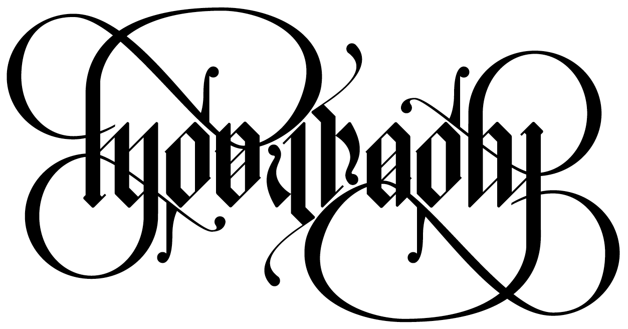
A competition to make ambigrams from the Typophile days, lots of swashes to sort of make it work – gadzooks.
The Frutiger numbering system (another Typophile competition, they weren’t really competitive just a bit of fun)
8 Likes
13 Likes
I wonder when the English J acquired its soft G sound, rather than being a Y sound…
8 Likes
Yes, revolutionary…
Nicely done, though.
Mornington Crescent!
7 Likes