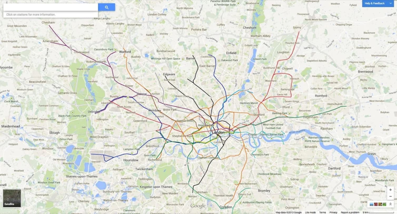
the scale of the map underestimates how much walking is required to get around parts of Brooklyn and Queens
Missing the point.
the scale of the map underestimates how much walking is required to get around parts of Brooklyn and Queens
Missing the point.
“It’s a map that’s both prettier and more legible.”
“it’s beautiful”
“It’s really just such a gorgeous design. I want this new subway map as a wall print, a full back tattoo, or possibly both.”
“Prettier”?! Pfui! “Beautiful”?! Bah! “Gorgeous”?! Gag me with an off-ramp!
That last bit I quoted makes me so very happy that I do not know this person.
Michael Rosen’s “Alphabetical” says that the pronunciation predates the existence of j as a separate letter, with Old Norman pronouncing initial ‘i’ as ‘j’.
Pretty much.
So, in Latin, the letters i and u did double duty. In some contexts they were the vowels /i/ and /u/: intra, pueri, ultra, dictu. In other contexts, they were consonental: iuxta, ientaculum, uictor, uentus. This is why those two letters were called semivowels: Because sometimes they were vowels, and sometimes they weren’t.
Latin didn’t make a big deal of indicating vowel length, and when it did it did so with an I-longa, or with a apex (the forerunner of the acute accent, which you can see in some inscriptions, but only if you’re looking for it). They didn’t show vowel length by doubling the vowel after the Old Latin stage. So uacuum was either two syllables “wak wum”, or three “wa ku 'um”. (Wiktionary indicates that in Proto-Italic it was the first < *wakowom, and in classical Latin it was the second.) tuus could only be read as two syllables: /tu.us/. And so on.
(As an aside, you can see this in Old Irish: the word for “grandson” or “descendant” was úa /ʊ.a/. But they were still thinking of the Roman script as something you wrote Latin in, so when they saw ua, they instinctively read it as “wa”. So in Old Irish, you’d see that word written hua. The “h” wasn’t pronounced, it was just to make you know that it was /ʊ.a/, not /wa/.)
The name John in Greek was Ἰωάννης (Iōánnēs), with a yod initial. This was borrowed into Latin as Iohannes. When this name got to Ireland in the 6th Century with the first missionaries, it was Gaelicised into Old Irish as Eoin, still with the yod initial. In Europe, however, other things were happening to the name, so the Normans had Jehan… only they spelled it Iehan, because the letter J didn’t exist yet. And yet we know that Iehan was pronounced /ʒ/, because it was reborrowed into Irish as Seán, which was always /ʃʲɑ:n/. In Middle English, the orthography was heavily influenced by Norman French because of course it was, but also by Old English, and this goes some way to explaining why English is like it is, but there were multiple ways to spell some sounds, and the orthography for the sound /ʒ/ could be i-, or g-. (I have a suspicion that early on at least consonental i was more /ʒ/, and soft g was more /dʒ/, so iuge was /ʒu-dʒə/, but accents and dialects mean that can’t really be relied on.
So there’s a Middle English cite
c1450(?a1400) Wars Alex.(Ashm 44)2400 : A croune all of clere gold clustrid with gemmes [“gems” /dʒem.es/]…A Ientill [“gentle” /dʒentil/] man þat Iowell [“jewel”/dʒowel/] enioyned [“enjoined” /en.dʒoi.ned/] was to kepe.
Two ways of writing the same sort of sound… but the poetic convention of alliteration mean that we can be pretty sure that they were all the same sound.
By this time there were variant glyphs for u and i. v was a variant of u, which was often used initially in running text: vast void vniuerse, and the capitals U and V were completely interchangeable. It was only post 1650-ish that they definitively settled into the pattern we now know.
And there was a variant of i, which was just to give it a little tail to create j. Initially, this was so that you could tell an i from the stroke of an n or m or u. (The term of art to look up is the “minim problem”). When you had a number, especially, you’d use j as the last in a string of them, so that you’d have i, ij, iij, iiij, u, uj, uij… We still have that in Dutch, where a long i was ii, only it was spelled ij, thus “Rijks”. Only in handwriting they’d run together, so it would look like a “y”, so to distinguish ij and y, the former would keep the dots: ÿ vs y, so you might also see “Rÿks”, or just “Ryks” depending on local habit.
Again, the modern differentiation between i and j as we know them now is post 1650, when the use of i for the /ʒ/ and /dʒ/ sounds was already hundreds of years old.
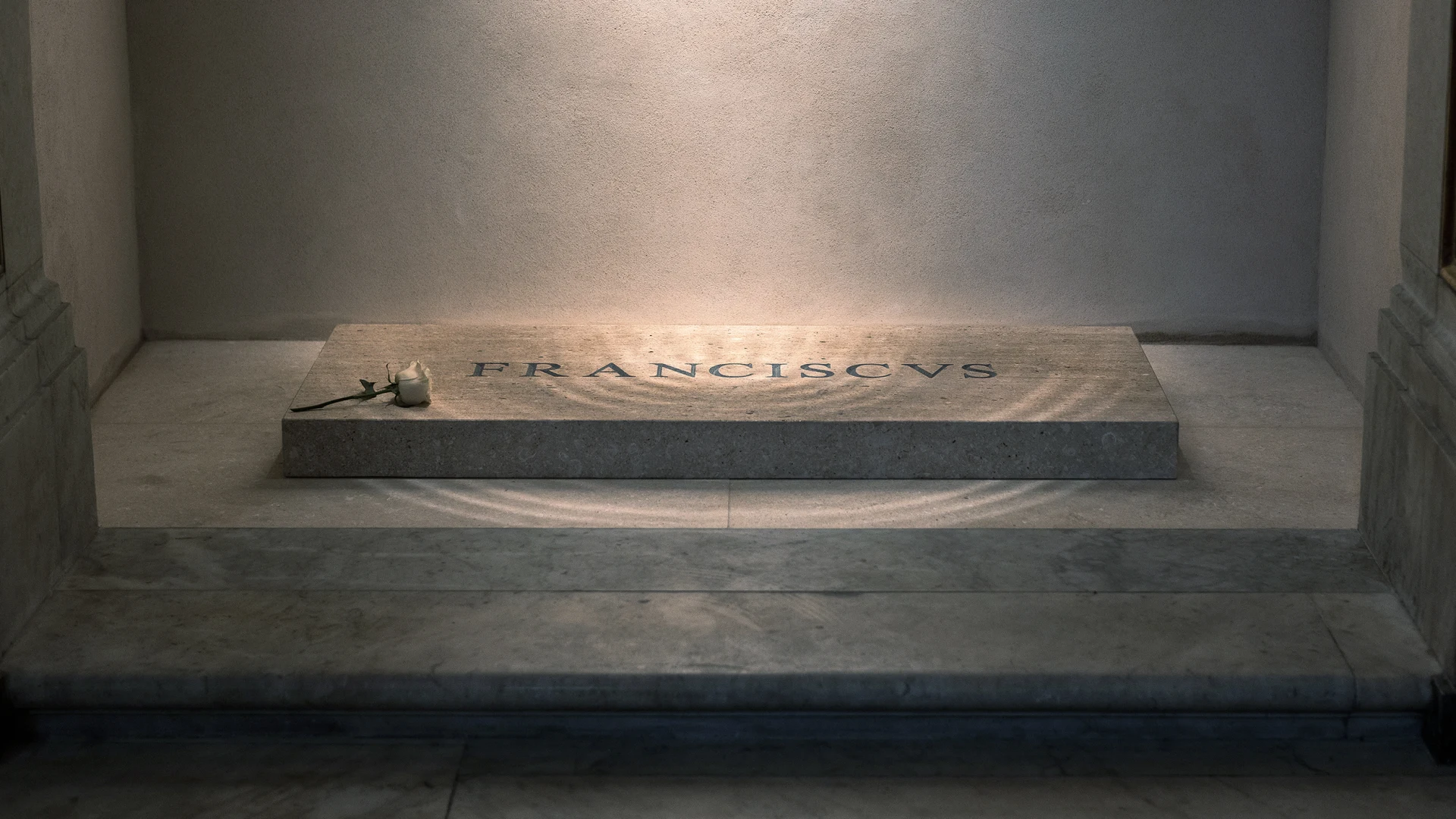
Ugh… Now that’s one sloppy job.
On the other hand, I sometimes threaten people with “I’ll make sure the writing on your headstone will be done in Comic Sans.” Adding “And with really bad keming.” would be a nice escalation.
But atop that marble is a tomb inscribed with the name “Franciscus.” Or what—due to terrible spacing between letters, known as kerning—reads something more like “F R A NCIS VS.”
“An article about typography, we should proof read this carefully”
“Nah”
It’s even worse
while also pointing out that the inscription was set in Times New Roman and then carved.
They could have at least chosen Trajan, or one of the other display faces based on Roman epigraphy, rather than a newspaper typeface
In the grand scheme of things, the kerning on Francis’s tomb may not be of much consequence, as it does little to mar the legacy he leaves behind. And indeed, for a pope famous for his humility, perhaps there is no greater immortalization of that virtue than his name being chiseled so poorly in stone for the rest of time.
That’s true, but unless he chose it himself (which is entirely possible), it speaks not of his humility but of the lack of respect and care for his legacy by those that survived him
I mean… the idea is brilliant - but that’s just not how you format a list…
Or from an Argentine foundry (Sudtipos comes to mind).
I do wonder whether this is machine engraved rather than the work of an experienced memorial mason, which is, I suppose, in keeping with his reputation for frugal living.
You’re right! Argentina is a surprisingly big player in the field after all. I’m a big fan of Pampa Type Foundry and of Huerta Tipografíca myself
I wondered that as well, but even Word does a better job kerning than that these days.
Then again, whatever antiquated CAD software they may have used maybe doesn’t.
Yes, but anyone who cares can easily work around that. If needs be, by placing every letter separately. I did this in the 1980ies when I wanted building plans look good for presentations.
Well, there’s your problem


Holy sweet god almighty

My favorite comment on Reddit -
they just left room for jesus