Giggling away at “nearly 5 people.”
“Ah, depends what Trevor is doing on the day.”
Giggling away at “nearly 5 people.”
“Ah, depends what Trevor is doing on the day.”
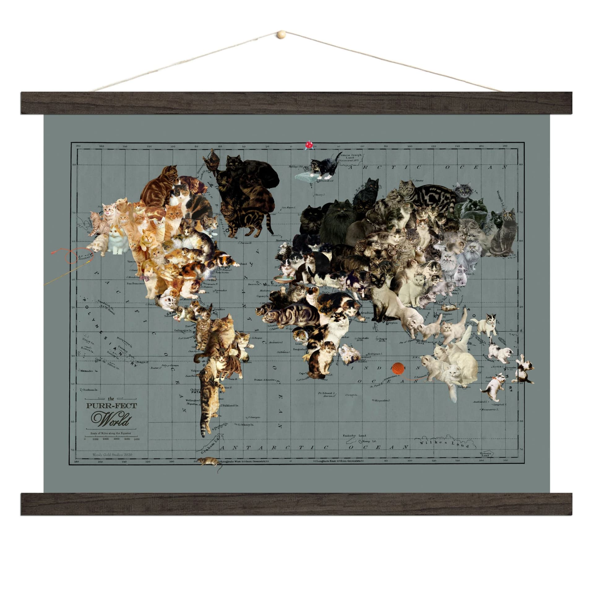
I don’t know why I searched for “cat map” but I did and I’m not sorry
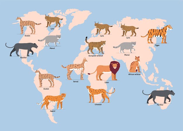
This one is from Wendy Gold. She has lots of map and globe stuff for sale on her website. She does collage maps and map art
Website: Map Art Prints & Canvas Wall Decor | USA & World Maps | Wendy Gold

I’m reminded of the Bellman’s ocean chart in The Hunting of the Snark:
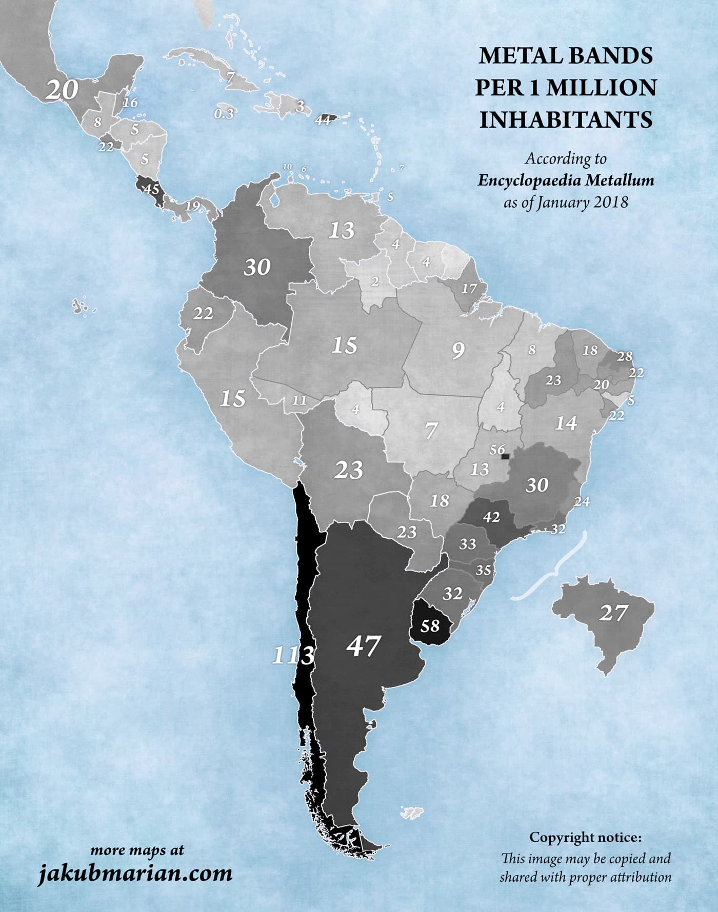
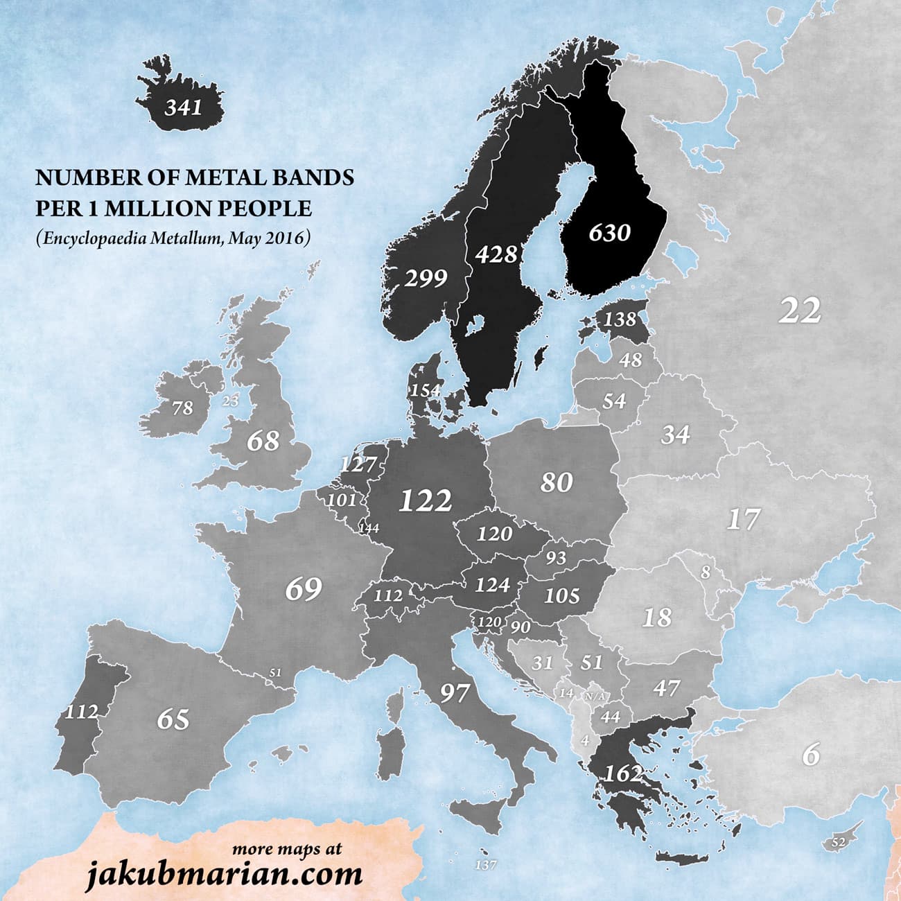
In both maps, the “number of metal bands per 1M people” increases the closer one gets to the nearest Pole.
…except in Poland.

Yes, I deserved that…
What da? My home county shows mainly horses, sheep, pigs and oh yeah nevermind.
Must be ferrous metal bands.
Oh, my sister lives in a place famous for dogs… At least that’s what I understood from the map.
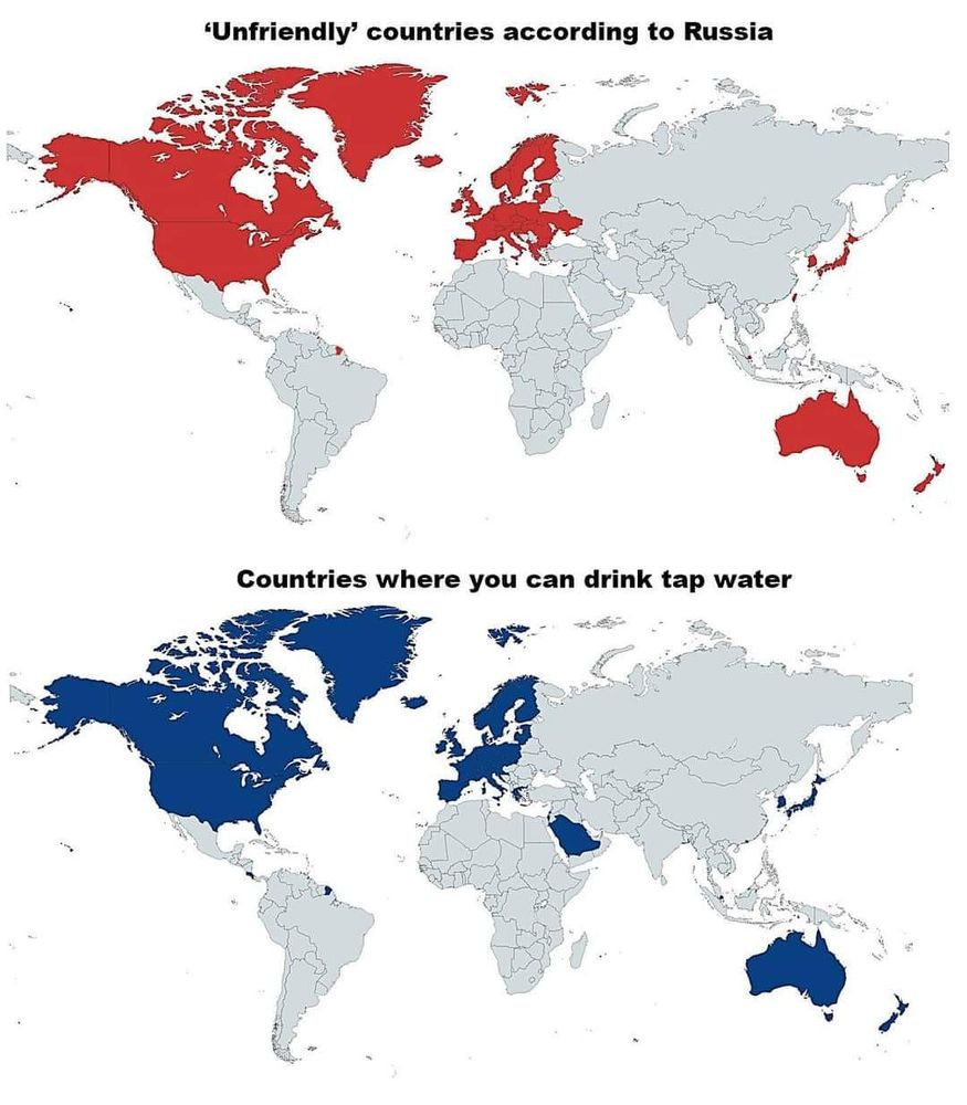
Costa Rica wins again!
And here are a couple of interesting maps from the article:
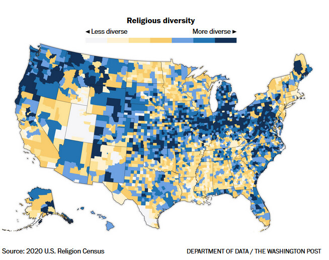
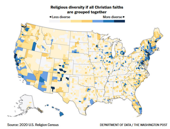
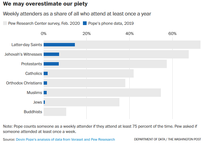
First of all, this comparison of religious diversity and religious diversity if you group all christians together.
Which Immediately brought to mind the line from The Blues Brothers
“What kind of music do you usually have here?”
“We got both kinds, we got country and western”
And this little comparison of two methods of data gathering, which neatly illustrates how some people might not tell the truth on surveys:
Ah, Hennepin County. That shining beacon of the Midwest.
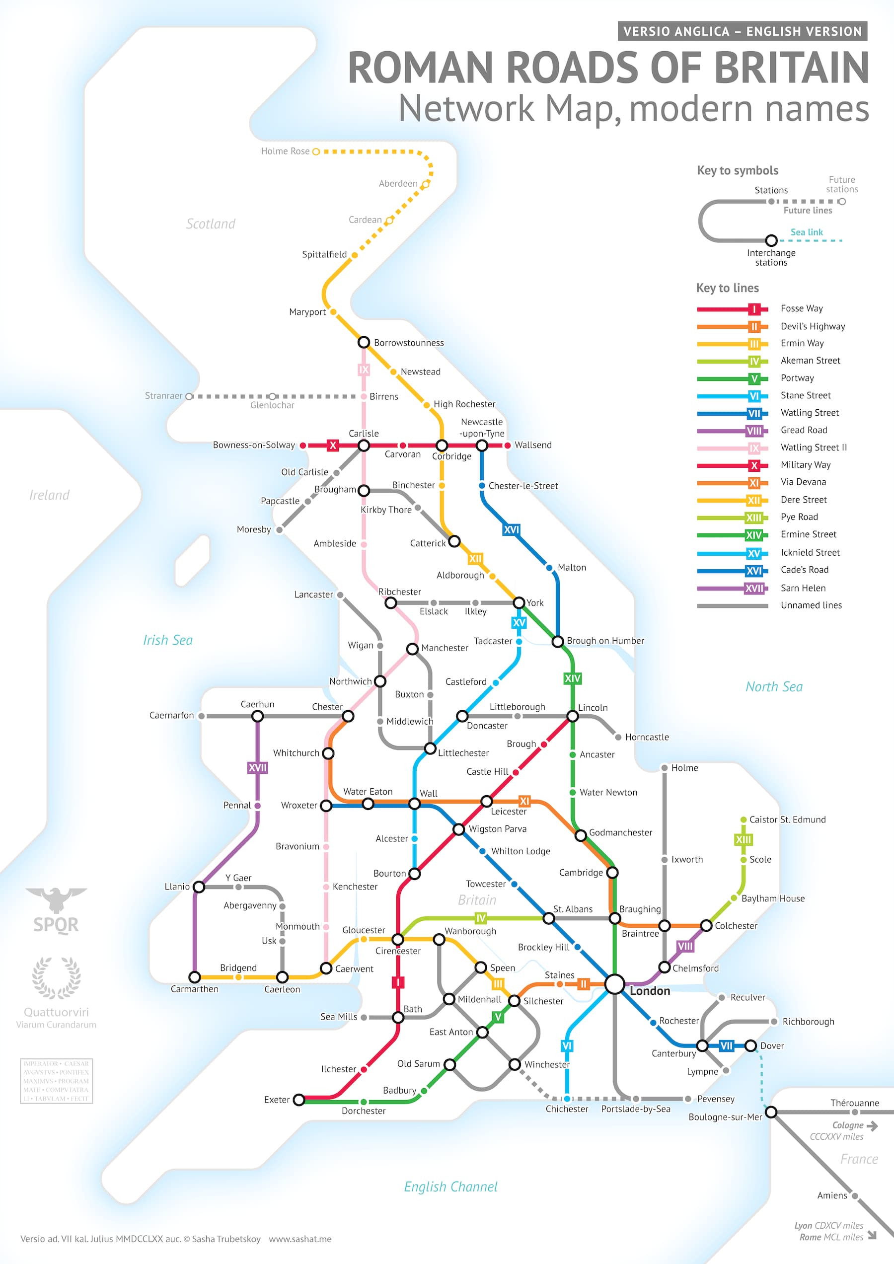
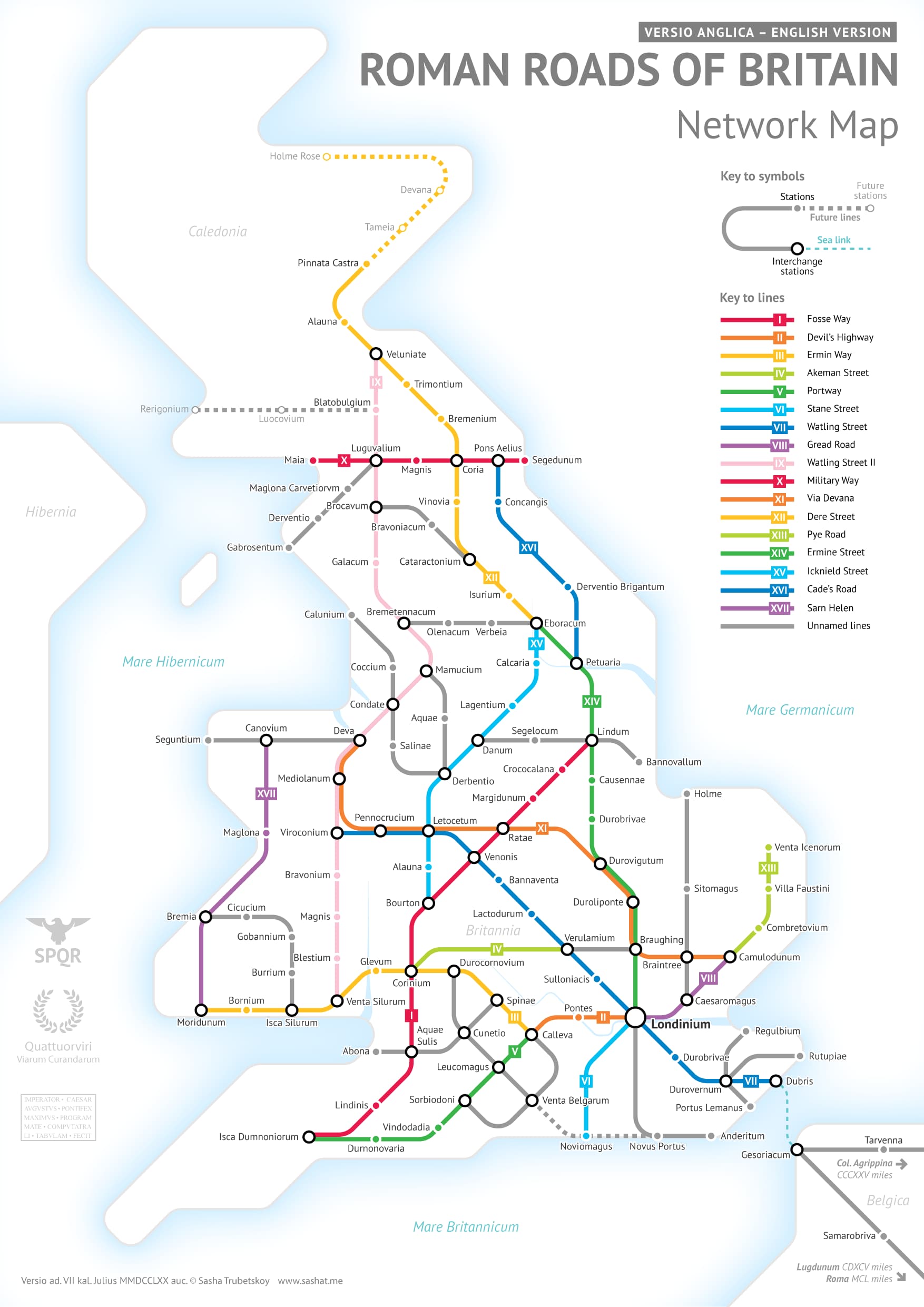
Oh yes, this one is amazing. It even shows my hometown, a small provincial town on the very edge of the empire…
I found the huge Ebstorf map (13th century) most fascinating - the original was destroyed in WWII, but a facsimile is being displayed in the Museum Lüneburg.