I’m not an artist, more a butcher of code and mangler of words. When the images scale, the E should look much better - I essentially ran it through an upscale filter and pasted it on as a different colour, then used the select tool to delete.
Edit:
2 Likes
Sorry I’ve been on crazytime lately. I think I can do some logo stuff over the weekend.
2 Likes
Hey, I got a question. What do we call the wee icon that appears at the left corner of the browser tab?
Wouldn’t it be neat to put the li’l coffee cup there? Class it up like that Slate tab is? I just kinda hate the default Discourse one.
4 Likes
That’s the one that’s called a favicon:
A favicon /ˈfæv.ɪˌkɒn/ (short for favorite icon), also known as a shortcut icon, website icon, tab icon, URL icon, or bookmark icon, is a file containing one or more small icons, associated with a particular website or web page. A web designer can create such an icon and upload it to a website (or web page) by several means, and graphical web browsers will then make use of it. Browsers that provide favicon support typically display a page's favicon in the browser's address bar (someti Favicons ca...
3 Likes
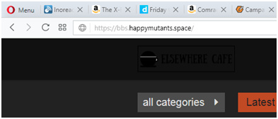
The Elsewhere Cafe logo has started showing but it’s almost invisible on the default dark theme.
Is it possible to get a colour reversed version?
2 Likes
See here:
OK, I did a thing.
It should be live for both the default and light themes. Ironically, it really only looks acceptable on the light theme. I’ve got an idea on how to manage that, but I’m tired and I’ll look at it later.
It’s a redraw of @ChickieD ’s concept, but it’s by no means intended to be the last revision, or intended as criticism of either her or @tinoesroho ’s work. I just wanted to try something out.
I’m not thrilled with it either. Consider this iteration #1 .
2 Likes


