I thought of you, @MarjaE when I read this - especially with the earlier posts about PWM.
Since it’s not one boxing: “The iPhone 12 Mini Makes Me Sick (Literally)”
I thought of you, @MarjaE when I read this - especially with the earlier posts about PWM.
Since it’s not one boxing: “The iPhone 12 Mini Makes Me Sick (Literally)”
Nausea that bad may be the first sign of a developing seizure disorder. The author should get it checked.
They all ask me what to do. And the answer is, as you figured out, just return it and try another display.
IMO, obvious flicker should be considered a health hazard. Obviously more research is needed, and more concern for the consumer ought to be taken by the companies.
I’m not holding my breath.
A lot of dishes have circular bases instead of the traditional three-foot base.
If you wash them, and then dry them upside down, they don’t drain properly. This is especially frustrating with cups and mixing bowls, where it may not be practical to set them up sideways.
It is now apparently impossible to disable autoplay on YouTube.
On my machine, the widget seems to be nonfunctional.
I use Youtube No Buffer.
I think there’s a Chrome version, too.
I couldnt read the article, because of the animation, but what the fuck…
Who decided that???
https://uxdesign.cc/legibility-how-to-make-text-convenient-to-read-7f96b84bd8af
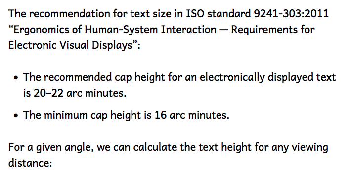
I can’t read text at less than 18 arcminutes. And I find it uncomfortable at less than 22 arcminutes.
P.S. In Dark Mode, about 30 arcminutes.
Okay.
LibreOffice and NeoOffice have inconsistent support for small caps. I can get them to work in Writer, but not in Draw. Can anyone recommend fonts which:
a. Are easy for people with dyslexia, gaze stabilization issues, focus issues, etc.,
b. Have slightly larger upper cases than lower cases-- maybe 1 1/4 to 1 1/2 times as high. Nowhere near 2 times as high because either the upper case will be far too big or the lower case far too small.
g. Have the same or similar capital letter forms for both cases.
d. Preferably resemble late ancient and medieval scripts.
e. Work with the Roman alphabet.
f. Work with Indo-Arabic numerals.
Andika and Opendyslexic fail on b, g, and d. Skeirs fails on e. Copperplate on a, and d. Most fonts fail on a, b, g, and d. Various Uncial-inspired fonts I’ve tried fail under either a, b, g, e, or f. A lot have samples using small caps which make them look like they’d achieve g.
File transfer from Android…
Android File Transfer is the standard recommended option, and it’s not an option. It keeps other apps such as Calibre from communicating with the device, it turns itself on when you plug in the device, it installs a helper app so it can turn itself on whether you want it to or not, and even when you want to use it it’s a pain to use it, and it secretly reinstalls that helper app.
OpenMTP is better, but still a pain.
Calibre can export from its library to Android, or import from Android to its library, but that isn’t much use when you’ve updated a file, you don’t want to give each version its own entry in Calibre, and you want to compare versions before overwriting anything.
Okay, the easiest way seems to be to use a thumb drive. Does anyone know how to find out which thumb drives will be safe? Some note that they do have blinking indicator lights, but none note that they don’t…
I have a few of these:
These don’t have any LEDs on them and they are super fast. The price is reasonable and they have several options for capacity.
Thanks!
I hate having to fight the printer for several hours every time I want to print anything. Yes, I have tried turning it off and on again. I have been trying to print a test page to help diagnose the other problems, but first I need to diagnose why it won’t try to print a test page.
I updated Google Drive for iOS yesterday. This latest version relaunches every time I go to it. If I’m deep inside folders I have re-navigate to where I was was. Every time.
My iPad Air has 8 GB of RAM, and apparently that is not enough to keep it happy. It provides the same service but in a more inconvenient way.
My printer/copier/scanner sucks because it doesn’t suck in the paper, and I haven’t been able to figure out why; I can definitely relate, then, to your sitch.
It’s been Improved™!
So besides 1. harassing autistic users, 2. using ethnonyms as insults in its policy pages, 3. removing comments which criticize libellous articles, now 4. Wikipedia has rolled out a new site redesign, which follows standard web design trends and makes me very seasick.
Wikipedians have spilled more than 200,000 words on the page for Vector 2022 feedback, offering suggestions and criticism—meaning that there’s a corpus longer than Jane Eyre (and almost as long as Moby-Dick) about button positioning and table formatting.
That’s not even counting the 90,000-word-long discussion on whether the new skin should be default, which went down in autumn of 2022. It was a bloodbath: Crotchety Wikipedia veterans practically yelled “too much white space!” in unison while starry-eyed progressives condemned the kneejerk resistance to change. A few clever thinkers crafted a compromise plan. In the end, the 165 people who voted to oppose the redesign outnumbered the 153 supporters. Nevertheless, it’s happening.
That was as of a week ago, just before they inflicted it on the public. I’m sure by now the well-deserved criticism word count is at least a few War and Peace’s plus a Les Misérables, an Atlas Shrugged, and an Encyclopedia Britannica.
Naturally there are already browser plugins to force it to use the old skin (via adding the parameter ?useskin=vector to any Wikipedia URL, which coincidentally bypasses the cache and is therefore going to cost them a lot if many people use it).
It’s definitely a regression, but at least not as bad as it was the first day or two, when the main content column was only about 2 inches wide which was just ridiculous.