Whatchya Workin' On, O Creatives?

Stay healthy!

4 Likes

Give us a full report once it’s done…

1 Like

I will! I’m sooo excited. The place is a total haven.

3 Likes

Congratulations - does that make you…

a Chattanooga Guru?

4 Likes

Yes! The chop chop is about 2 mi from me, btw.

3 Likes

A year ago, I started a model railroad kit – not a railroad car, but a building. The photo on the kit box suggests it should look like this:
manuf_image
Your typical old-fashioned corner drugstore.

The walls are beautiful flat plaster castings, molded from hand-carved masters, that you have to sand and fit at the corners. But I screwed up the corners; they didn’t come together as nicely as shown in the picture. Then I managed to poke a finger through the delicate entrance section.

Phooey.

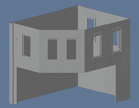
After some thought, I decided to see if I could replace the plaster walls with 3D printed ones. I used a free program (for making cameos from a photo) to convert an image of a brick wall to a 3D file, and used that as a starting point. Here’s the building in the CAD program (minus some trim and the doors and windows):


One thing I like is the brick pattern is less regular than the kit’s.
I used the kit’s molded plastic windows and doors, and the triangle roof trim, but other than that, mostly just the design.
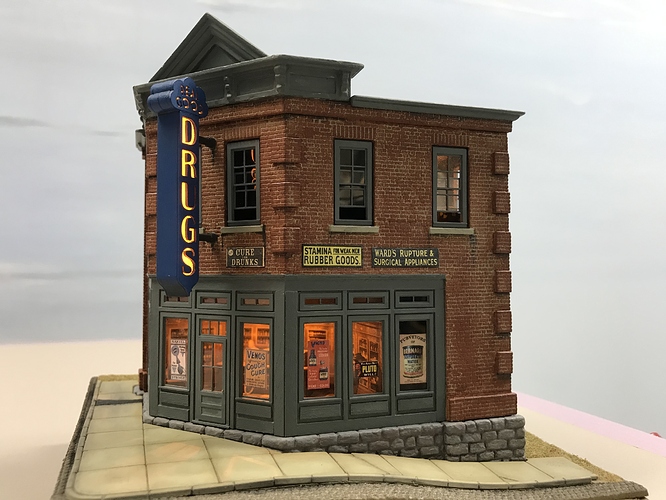
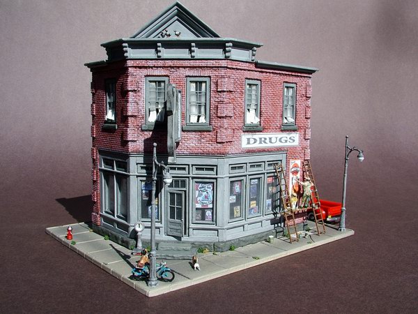
And here is the final building (I didn’t take any pictures during construction):

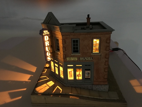
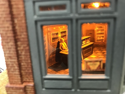
The sign is also 3D printed. The building didn’t fit the kit’s foundation, so I carved my own from plaster, then carved the surrounding “ground” out of foam. The sidewalk is made of squares cut from plastic sheet. The signs are from images from Google, which I cleaned up (and modified in some cases). I painted the building, and weathered everything. I made interiors (with lighting) to give it life. The effect of light and shadow on the sidewalk was a nice surprise!

A lot of work but fun to figure out how to do things.

The pharmacist isn’t very busy at the moment.
16 Likes

did you put any real good drugs in it?
that came out great, man!

8 Likes

wow, this is beautiful!

8 Likes

Bravo! Gorgeous.

3 Likes

If anyone wants to study yoga with me, hop into my online membership.

https://www.suzannedulin.com/lite/yoga-membership-site-beta-launch

4 Likes

cory posted this image on his site because there’s a Kickstarter for these magnets.

my postman is a pretty cool guy, so I wanted to show my support. using that image, I freehanded the whole thing (erasing all the guidelines and sketchy lines before filling in the blue)

7 Likes

Good idea!

2 Likes

IMG_20200822_175523_1 (1)

4 Likes

The completed hat.

4 Likes

another sign for deliveries.
the one in the post above the reply link goes to bit the dust due to poor lamination job, but also I got rid of the cushion and added a thing about the welcome mat.
hopefully it’s not too passive-agressive, but the rainwater is a big problem.
it’s visually a bit busy. I toned a few elements down and this is what I came up with anyway. I like how it came out but remains to be seen how effective it is.

recursion!

7 Likes

My living room floor:
IMG_20200831_190210_1

3 Likes

art

3 Likes

I hope this isn’t taken as an insult, but you should work a little ark in the pool of water. I mean, it would be cute. I love the whole thing!

I showed this to my son, and he liked it; when I scrolled down to show your actual porch, he saw the dog first and said, “Doggo, doggo!” (we both say that when we see dogs, though; but I usually use the now not-cool “goggo”.)

2 Likes

The completed neck gaiter:
IMG_20200831_234840_1

4 Likes

118728591_10157519349713342_2287130117914822441_n
Formerly packing for a jar candle.

4 Likes