Could it have been debilerate?
11 Likes
I think so. I’m sure it’s brought on many a smile, even some bubbly chuckles, which may well have been some wag’s intent. In which case, not so egregious!
10 Likes
Maybe it was perfectly legible to the divers who ignored the warning above it…
![]()
![]()
![]()
10 Likes

Designers Do a Double Take at the Lettering on Pope Francis’ Tombstone
Irregularly spaced letters spelling “F R A NCISC VS” have caused a stir among typography nerds who specialize in spacing and fonts. One called them “an abomination unto design.”
14 Likes

FTA:
“Why does it look like pressing on the letter ‘A’ will open a secret chamber where the ark of the covenant is stored?” asked Elle Cordova, a digital creator, comedy writer and grammarian.
“It looks like they downloaded a bootlegged version of Times Roman without any kerning data embedded in the file, brought it into some ancient software, like Adobe Scribe 1517 A.D., and then let the software space the letters,” she said. “And this is what you get: an abomination unto design.”
![]()
I don’t believe it was just a lack kerning. Instead it looks to me like it was deliberately made to look as bad as possible.
10 Likes
Some other possible misspellings
FETED PEE - we celebrate urine!
DEFT EPEE - nice swordsmanship sir!
TEPEE FED - I just ate in the tent. No swimming for an hour!
11 Likes
No, see, the letters come in blocks of two. So for instance you can have two Es in a row after D or F, but not after P or T like in those examples.
7 Likes


6 Likes

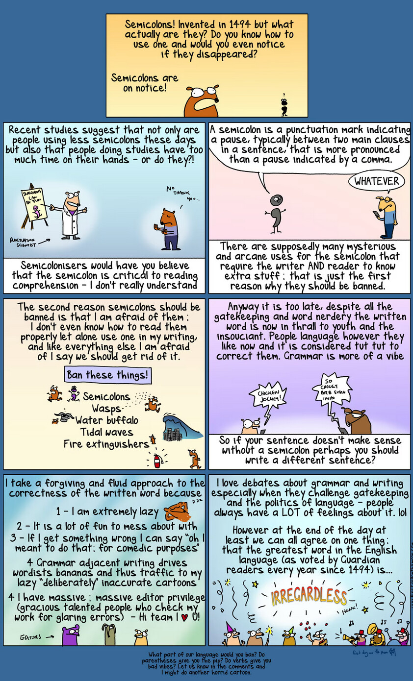
Random thought of the day: a semicolon is a dotted comma.
In music, a dotted note is held for 50% longer time than its un-dotted version (e.g., a dotted quarter note is treated as three eighth notes). A semicolon serves much the same purpose - it’s a pause that is somewhat longer than the pause created by a comma.
15 Likes
12 Likes


8 Likes
At this point I only use semicolons when making lists of elements which themselves include commas.
12 Likes
In formal writing I also use them for that, but also between two “sentences” where the second has the effect – aided by a semicolon – of completing a thought started by the first. In informal writing, I never use them; that could seem… pretentious.
12 Likes