Right. The small context menu that defaults to something other than what was copied or where it’s being pasted, because styles, and then doesn’t go away after you’ve wasted time telling it that you want it to paste WHAT YOU FUCKING COPIED, obscuring where your cursor is and making editing impossible? That context menu? I am familiar with it, yes.
12 Likes

It will be so much simpler once the context menu is just a message that states, “Don’t yell at me. You are the product.”
10 Likes
9 Likes
The candelabra looks a little out of place, but pretty great overall.
6 Likes
15 Likes
11 Likes
This museum always struggled for attention in Stockwell and effectively closed in the early 2000’s but a visit was always instructive, the custodians were so enthusiastic and keen to share the decades/centuries of learning.
13 Likes

11 Likes
14 Likes
Here’s an interesting article about Zohran Mamdani’s campaign posters, why they don’t look like typical US campaign posters, and the ideas behind the design choices:
14 Likes
Is this the one case where the thumbnail arrow actually makes sense?
12 Likes
Yes
11 Likes
13 Likes
Foid.
11 Likes
![]()
12 Likes
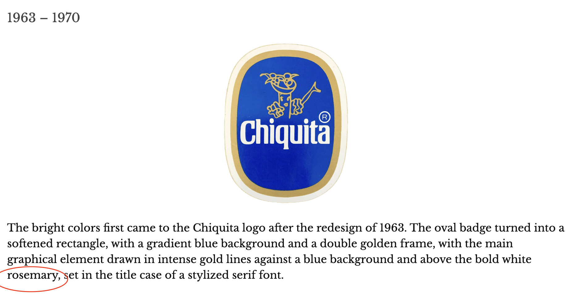
That is a very nice logo! If you ask me, Ford should have gone with it.
9 Likes
Fnord:

9 Likes
Which one though …
6 Likes