Yeah, I expected that to be a clever joke on bastarda, tbh
7 Likes
17 Likes
It’s kinda practical when idiots label themselves in a clearly visible and permanent way.
11 Likes
More of them should get them in easily-spotted bodily locations, such as the forehead/face (granted, damn near any forehead/face tat is an immediate giveaway) or neck.
Once took a bus trip in Ontario, CA sat behind a chap w/a neck tat. It said ONTERIO in some wretched fake olde-timey blackletter font, surrounded with ridiculous olde-timey fancy scrolled flourishes. After he disembarked, I mentioned it and its missspeling to my BF. He informed me, in all seriousness, that that’s actually how the Onterio gang of Ontario spells/-ed its name.
12 Likes
7 Likes

Ta much, luv, for hipping me to such a wonderful word and its meaning ![]()
8 Likes
Makes it easier for counterfeiters.
9 Likes
That reminds me of the ad for shorthand course.
If U cn rd ths u cn gt a gd jb.
10 Likes
I am not a font geek, but that was an absolutely fascinating exposition of the history and usage of one font. I won’t be able to unsee its ubiquity from now on, I suspect.
10 Likes
This is a trailer for Helvetica.

The full film is on iTunes and others.
10 Likes
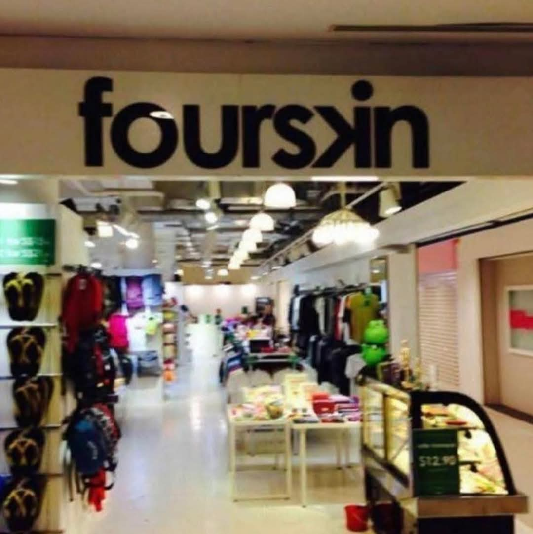
Kerning and OCR.
I recently had to scan and OCR a printed article, for digitising. Reading it through I was perplexed by the phrase “…he nibbed them…”
Upon referring to the original, it was, of course “rubbed”.
It was perfectly readable in the original, but perhaps my OCR software has a preference for looser kerning standards. ![]()
10 Likes
11 Likes
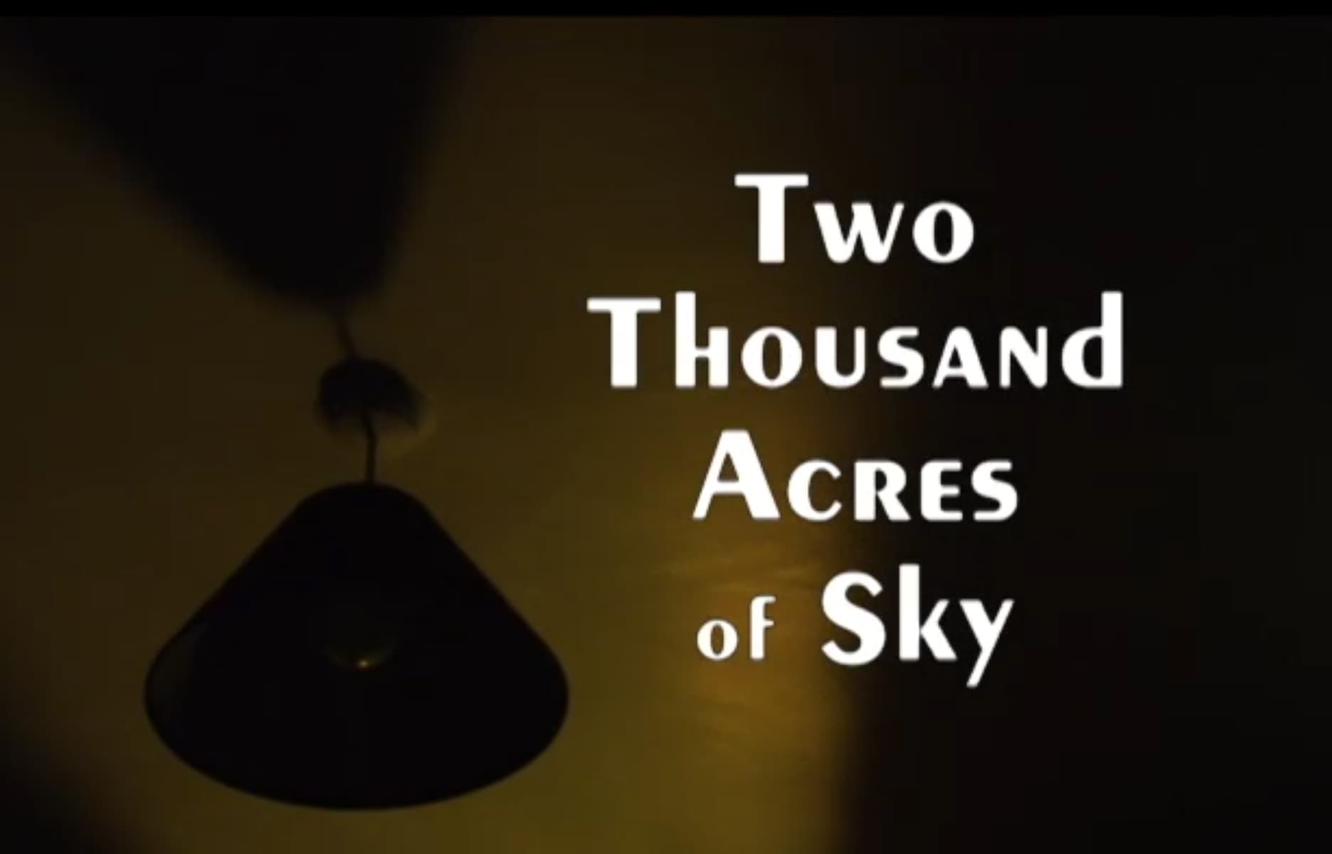
Watched a season of “Two Thousand Acres of Sky”. The show I could take it or leave it, but the font I love for being completely bonkers.
10 Likes
Peignot
by A. M. Cassandre
Kerning aaaaarrrgh.
11 Likes
12 Likes