I concur.
I have zero graphic talent but the only change I would make is to make the handle more practical (i.e. stick out more). If I get to a proper computer with Gimp and not this tablet, I may draw it so I can be laughed at (as happened the last time I attempted a graphic).
4 Likes
Yeah, I have a weird gift for taking an idea and turning it into the obvious visual thing.
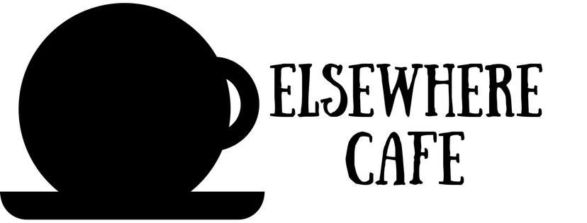
We can easily make this into a horizontal version like this and then the image by itself can be a favicon/icon
4 Likes
I still want a thin cup-demarking line because I like the idea of a world inside of a cup so much.
1 Like
The only thing I have to ad about the logo is that another version will be needed for when it’s very small. This is muddled.
![]()
I think something with just the E would be nice, for the favicon and the top/left logo. Like this, errrr -ish:
![]()
8 Likes
think we cross posted. See above.
2 Likes
Agreed. I did this in Canva and it’s very limited but fast. I’d like a better version of this and agree the handle should be adjusted.
And I’d like a thin line just barely indicating the outline of the cup.
Also I want more Edward Gorey vibe to the cup - perhaps if it were more of a dark shade of gray than black that would help.
3 Likes
Have you tried Inkscape before? I think it would be suitable for this kind of design, while giving you some more flexibility.
My concern about the handle is that due to the circular shape of the cup, it looks like it might be tipped forward, which makes the handle the wrong angle. Some shading or depth cues might help avoid that, as I don’t think you could just turn the handle 90 degrees. It would just look like a straight line sticking out the side.
2 Likes
I have illustrator so if people generally like this idea, I can start working in that if I am somehow the designated logo designer.
2 Likes
I feel like if it’s going to be a coffee cup viewed from the side, and the snowglobe thing is abandoned (which I agree with) it needs a flat top. Otherwise it’s a circle with a handle and a saucer 
4 Likes
To quote Mikhail Gorbachev when the workers at a factory asked him who would run it now Communism was over, "If not you then who?"
If you don’t want to that’s entirely your call, see my observations above. The labourer is worthy of his hire. The grey area is when the labourer gets to decide his (or her) rate.
3 Likes
I enjoy doing logo work and don’t get to do it much.
I’m going to let this comment thread be open a little bit longer to get more ideas on how to improve this idea and then I’ll get to work.
3 Likes
That is totally a chai latte
2 Likes
Nah, it’s a hot cocoa. With one big spherical marshmallow!
All things to all people, y’know.
4 Likes
Well, there goes my idea for an orange owl being crushed with a jackhammer.
7 Likes
It’s a nice thought, but I’d honestly rather concentrate on making this our own place. 

8 Likes
There is still room in the manifesto!
6 Likes
That could be a secret logo found in an Easter Egg location, though.
10 Likes
Or, alternatively, Jill sitting at a café table, enjoying a nice hot bevvie, jackhammer leaning against the table edge.
9 Likes
That’s a brilliant image. 
6 Likes