Unsanctioned thread to share mockups of the future site logo
What do you want it to look like?
3 Likes
I was thinking something rounded and blue /yellow for the font. Kinda like the opposite of the bb font.
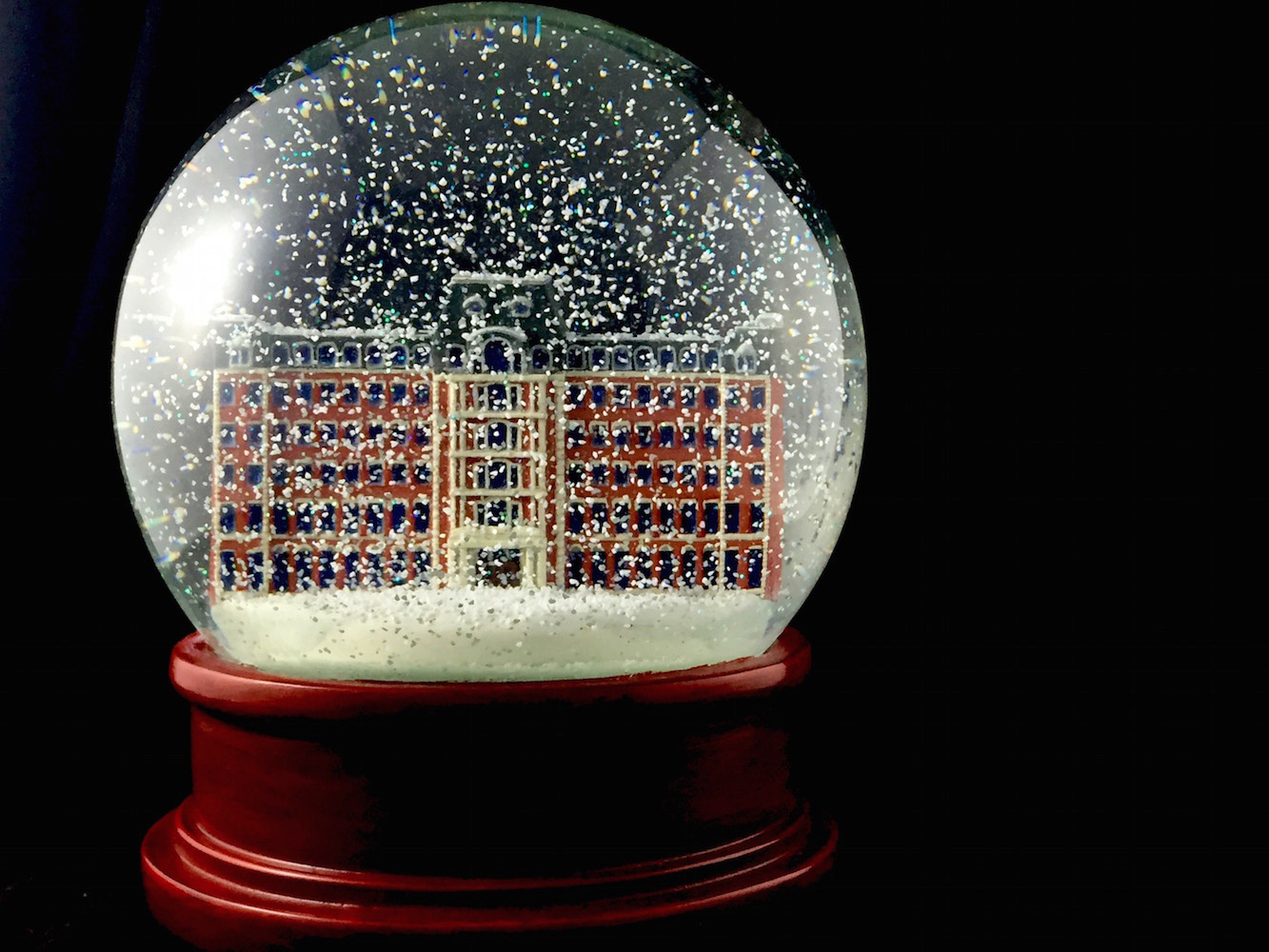
If there’s a logo, I was imagining a city inside a closed circle. In other words, something that looks like a snow globe but isn’t a snow globe.
I’m not committed to these designs at all, but they are simply the first mental images that popped up for me.
3 Likes
Consider it sanctioned. I just hadn’t gotten around to starting one myself.
I’d prefer we avoid too many overt references to the other place and the events that led to here. To repeat an earlier theme, let’s be about something instead of against something. Consider that as input, though, and not a unilateral declaration.
6 Likes
Just off the top of my head:
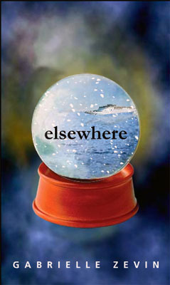
round, like a snowglobe. If cafe is the TLD, then a mug and a teacup inside the snowglobe. If community then some silhouettes of people from the chest up populating the snowglobe.
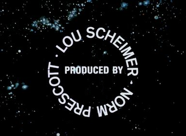
Maybe E L S E W H E R E circling the snowglobe, but only once so it doesn’t look too busy, like the Lou Scheimer Norm Prescott in the Filmation Logo of the early 1970s
4 Likes
That’s why I like the rounded blue or yellow font for the logo. It’s completely different.
I like the cup and saucer idea even better than what I had visualized. I also think it should be inside a circle. Those who think we should commemorate St Elsewhere Day can call it a snow globe, those who don’t can easily say it isn’t one ![]()
3 Likes
What are the height/width parameters for this logo in its main location?
3 Likes

5 Likes
Having created a Discourse board, I know the logo area is not that large. Already some of the suggestions seem too square or complicated for such small real estate.
2 Likes
Good point.
Here’s the Logo entries from settings, with some general guidelines:
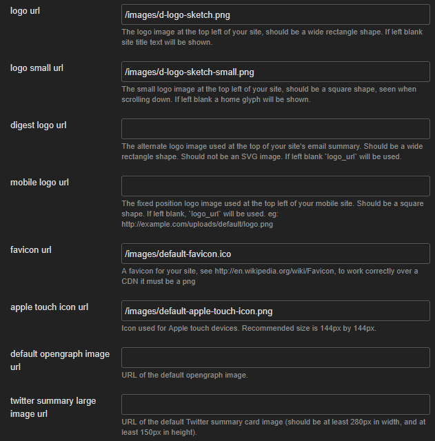
For reference, the current logo is 244x66 and the small logo is 66x66.
2 Likes
I did some sleuthing on Discourse Meta board:
The default full-size logo is 122x33 px, and the small version you see when scrolling is 33x33 px
Another user said they wanted their logos to look good on retina, so put in a 244x66 logo & 66x66 icon, and it they look fine.
CodingHorror says it’s CSS and will size to whatever.
w> e specify square for the small logo and wide rectangle for the larger logo. Actual pixel dimensions are irrelevant, as the browser (with the sad, forlorn exception of IE11 and Edge) will resize the image as needed.
You also want a larger image for retina-class devices with high DPI, so an actual pixel size would be incorrect..
My experience was that it wouldn’t just accept whatever and that I needed to stick within the dimensions to make it look right.
4 Likes
We should probably be fine if we keep to those aspect ratios, although there may be some flexibility with that. The large logo is 3.7:1 and the small logo is 1:1.
It’s also worth noting that the small logo by default is a truncated version of the large logo, which is replaced in the header once you scroll past the topic title. Keeping that relationship should provide a smooth transition.
2 Likes
Thematically, the logo might convey the idea of absence, departure to a better place, etc. Maybe you have a series or arrangement of glyphs that lead you to expect X, but X isn’t there—the visual equivalent of Shave and a Haircut without the “two bits.” Something should feel like it’s missing.
I’m not suggesting that we further reference the other place, mind you, but departure is kind of inherent in the name “Elsewhere.” In a broader sense, this might represent departure from the mainstream or quotidian.
3 Likes

A snow globe with an owl inside it? It’d be an inside joke for those of us in-the-know, and just a cute logo for everyone else. (Someone else needs to do it though…I have zero talent for graphic design. I can screw up MS Paint.)
2 Likes
I don’t like references to St. Elsewhere’s Day that are too over-the-top. A little reminder is okay, with a little plausible deniability for those who don’t wish to be reminded.
7 Likes
11 Likes
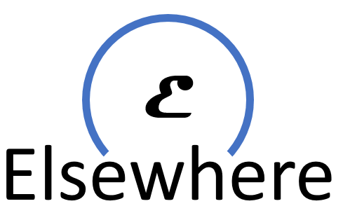
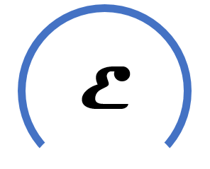
The “e” would work really well as a favicon.
Overall it actually looks a bit like a head and shoulders to me, and in that sense connotes daydreaming or “having one’s head in the clouds.”
2 Likes