8 Likes
I like that one! Especially the cheerful-yet-goth font.
1 Like
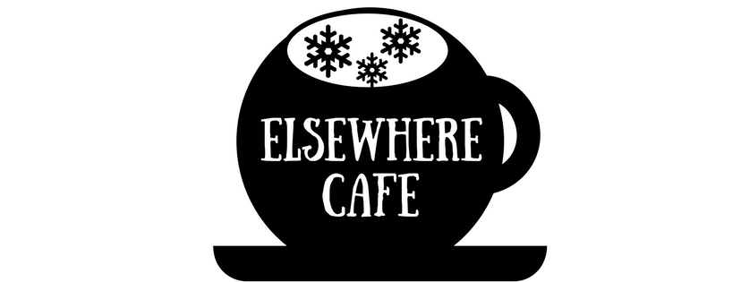
I think somehow the line could indicate a snowglobe in a coffee cup.
I liked the font, too - I was thinking Edward Gorey as inspiration.
7 Likes
um, that wasn’t clear. Thinking of adding a line to delineate the coffee cup, and then the top part could be a snowglobe.
3 Likes
“Elsewhere” makes me think of navigation-y sort of stuff…
And that makes me think of a compass or a compass rose, with the “E” and “W” labeled (so, pointing south) because acronym and all.
3 Likes
Canva is limited but good for mocking things up quickly. I was imaging the top as more snowglobey, but maybe this gives an idea of where I am going.
7 Likes
Snow globe in coffee cup is good.
Now I’m thinking of finding a coconut cake in a mug recipe.
5 Likes
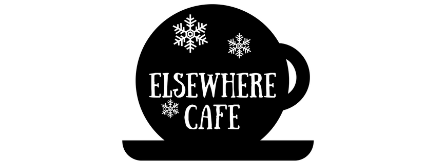
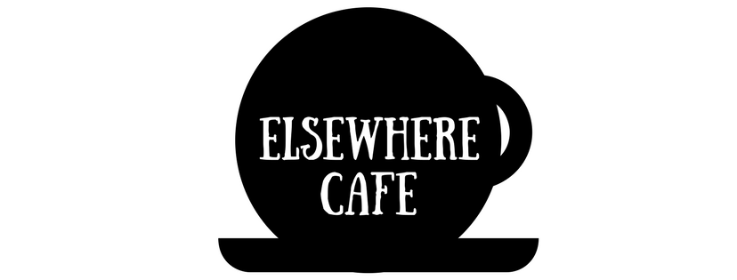
I like your first iteration, sans snow or any overt reference to a snowglobe. Fuck snowglobes and anything referring to the asshole owl that motivated us to haul stakes. I’m here because of you guys, not because of him. If anything, I’m here for the presence of you, and the absence of owls and snowglobes.
All that said, I really really like this:

And I don’t even like coffee. I can’t imagine finding a logo I’d like better. Stop the contest, as far as I’m concerned.
8 Likes
Being a non-coffee drinker, it reminds me of chai lattes with lots of foam – and of a fantastic lobster bisque I had once that was served with a saucer under the bowl and a layer of pastry on top that domed in the oven.
All very café, so yeah, I’d be very happy with that logo!
4 Likes
I concur.
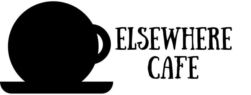
I have zero graphic talent but the only change I would make is to make the handle more practical (i.e. stick out more). If I get to a proper computer with Gimp and not this tablet, I may draw it so I can be laughed at (as happened the last time I attempted a graphic).
4 Likes
Yeah, I have a weird gift for taking an idea and turning it into the obvious visual thing.
We can easily make this into a horizontal version like this and then the image by itself can be a favicon/icon
4 Likes
I still want a thin cup-demarking line because I like the idea of a world inside of a cup so much.
1 Like
The only thing I have to ad about the logo is that another version will be needed for when it’s very small. This is muddled.
![]()
I think something with just the E would be nice, for the favicon and the top/left logo. Like this, errrr -ish:
![]()
8 Likes
think we cross posted. See above.
2 Likes
Agreed. I did this in Canva and it’s very limited but fast. I’d like a better version of this and agree the handle should be adjusted.
And I’d like a thin line just barely indicating the outline of the cup.
Also I want more Edward Gorey vibe to the cup - perhaps if it were more of a dark shade of gray than black that would help.
3 Likes
Have you tried Inkscape before? I think it would be suitable for this kind of design, while giving you some more flexibility.
My concern about the handle is that due to the circular shape of the cup, it looks like it might be tipped forward, which makes the handle the wrong angle. Some shading or depth cues might help avoid that, as I don’t think you could just turn the handle 90 degrees. It would just look like a straight line sticking out the side.
2 Likes
I have illustrator so if people generally like this idea, I can start working in that if I am somehow the designated logo designer.
2 Likes