Thanks for pointing that out. I hadn’t realized that was going on. For some reason the certificate renewal either failed or wasn’t running, probably related to a recent update. Restarting the container seems to have resolved it.
Oh, that was it! I thought something was weird when the DeNazi of the USA and the TMBG threads were the only ones I could access. Thanks for fixing it!
The failure mode on this was interesting. I’ve been having issues with my PC since upgrading to Windows 11, so I had chalked it up to that until I saw @ChuckV’s post.
To find out what was up, I made the bold move of signing in to the BB to see if I recognized anyone there I could ask. Felt weird. Like sneaking back into high school looking for familiar faces.
Yeah, the way it manifested for me was that I was seeing all the same ‘new’ posts that had been new yesterday, but no new ones and none of my replies (amusingly including one about an expired certificate on another site).
Pretty sure Firefox was just reloading a cached version of the site until I tried to post something at which point it just failed quietly to connect (error message in the console, but not on the page). Glad you got it fixed!
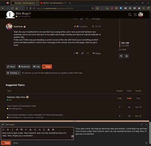
Once upon a time, the drag bar above the reply area worked. I could drag it up and have room to type a reply. Now it doesn’t, and I can only see/edit two lines of a reply. Here, I’ll give you a screenshot:
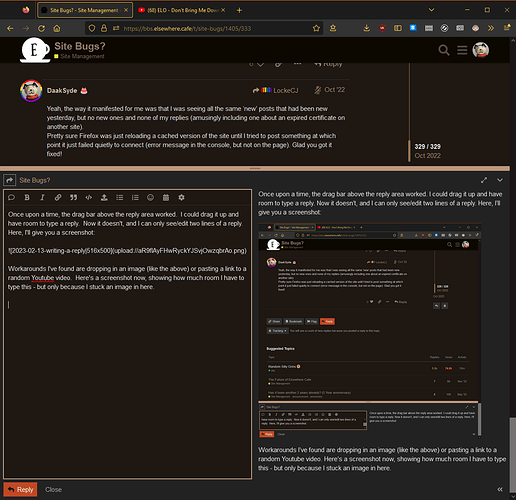
Workarounds I’ve found are dropping in an image (like the above) or pasting a link to a random Youtube video. Here’s a screenshot now, showing how much room I have to type this now - but only because I stuck an image in here.
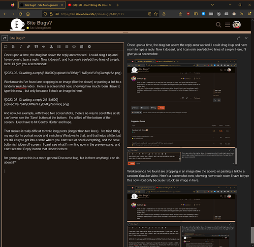
And now, for example, with those two screenshots, there’s no way to scroll this at all, can’t even see the ‘Save’ button at the bottom. It’s drifted off the bottom of the screen. I just have to hit Control+Enter and hope.
That makes it really difficult to write long posts (longer than two lines). I’ve tried tilting my monitor to portrait mode and switching Windows to that, and that helps a little, but it’s still easy to get into a state where you can’t see or scroll everything, and the save button is hidden off-screen. I can’t see what I’m writing now in the preview pane, and can’t see the ‘Reply’ button that I know is there.
I’m gonna guess this is a more general Discourse bug, but is there anything I can do about it?
Aside from dumping random images or links into a post to make the editing area bigger and then deleting them. Any way to get the drag bar working again and a scrollbar in the response area?
I have replicated, and can confirm that the problem exists in. A fix has already been added to the upstream repository, and will be installed when @LockeCJ’s work schedule permits.
Wow, that is really broken. I’ll get the update rolled out as soon as I can. The full screen editor seems to work as well, so that may be another workaround for now.
Thanks @DaakSyde for reporting and @tinoesroho for confirming.
![]()
Discourse is now at the latest version, but I’m still seeing the same broken behavior.
Still broken. I wonder when Discourse will fix it …
Anyone else getting a massive migraine-inducing painbar alongside everything? Even with a frame rate of 1/second, paging down the site feel like painfully smooth scrolling.
It’s a new feature that I turned on to test out. It should be possible to hide it by clicking on the hamburger (three lines) menu to the left of the site logo. Please try that and see if that alleviates the issue.
Okay, that’s gone. I hope it stays gone.
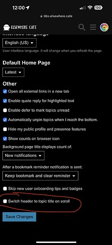
It seems like the “switch header to title topic” option keeps getting turned back on after a few days. It’s not a major problem to turn it back on or anything but I never see that at TOP.
Where do you adjust that? I just did a quick search, but couldn’t find that setting. Maybe I’m just tired, though.
It’s an extension so it’s not normal Discourse. It’s under Preferences ![]() Interface and it’s the last option.
Interface and it’s the last option.
That explains why I wasn’t seeing it. It only shows on mobile. I’m not sure why that preference would be cleared, but since it’s attached to a theme component, maybe that could go some way towards explaining it. That it works differently on BB than here is curious, though.
![]()
Maybe if I have some time later, I can look into how the component works to see if I can troubleshoot it further.
I’m used to being able to zip my mouse to the upper left of any Elsewhere page to click on the coffee cup, to get back to the home page. Now there are three lines instead. Maybe I could get used to it, but changing my behavior to suit a program on such a minor thing seems backwards.
So every day, when I first open Elsewhere, I us uBlock Origin’s lighting-bolt /screen-element-zapper to remove it.
Is there anyway to turn it off permanently? Or are we stuck with it? Seems to me it should be over on the right somewhere.
It’s a new feature:
Yours is the second bit of negative feedback I’ve received on it, and I honestly haven’t found a solid use case for it yet. As far as I can tell, I can’t easily change it’s location, so maybe it’s best to disable it for now? If anyone was particularly enamored with it, they can make a case for re-enabling it.
I ended up switching it to “header dropdown” mode. Maybe that’s a reasonable compromise?
I closed the tab (Firefox). Now the three lines are over on the right. ??


