I’m seeing that also, and I like it!!
4 Likes
Yes, that seems to be the primary difference. It also only appears when you click on it, instead of taking up space on the side by default. The intent is to be able to customize it with tags and categories you are interested in so that you have a quick way to get to them.
I can make changes to the defaults, if anyone has any suggestions.
3 Likes
I like that it has a list of keyboard shortcuts there (the keyboard icon in the bottom right of the dropdown). I didn’t even know some of those functions existed.
One of them being, just typing ‘gh’ when not in the editor will go to the home page.
2 Likes
That’s the one I’ve used the most over the years.
You can also get the keyboard shortcuts by pressing the question mark (?) key when not in the editor.
2 Likes
I should probably go hunt down where to complain/make a bug report for this, but one recent change I’m not very fond of: getting the list of “All notifications” first if I click on my user icon. The only notifications it shows me are notifications about earning badges - apparently things like getting a message or thread replied to isn’t good enough for “all notifications”, but getting a badge on your anniversary is. Every notification about the same badge has identical text, no context (not even how long ago it was), and they all just link back to page for the badge that was earned.
Maybe there’s the occasional rare case of actually useful notifications that can make it into that list?
[Edit] Ok, I just noticed the “Dismiss” button on that list, and when I hit that.. all those badge notifications went away, and other actually useful ones started showing. Which doesn’t exactly seem intuitive, but I guess this was mostly a user error.
4 Likes
It’s also worth mentioning that you can filter the notifications by type:

Top to bottom:
- All
- Replies
- Likes
- Personal Messages
- Bookmarks
- Other Notifications
- Profile
Me too.
3 Likes
I’d been doing that… and grinding my teeth that I had to do extra clicks to find any actual useful notifications, while all the completely useless ones were always the first thing shown right up front. ![]()
4 Likes
And the double line to change the size of the reply box still doesn’t work.
2 Likes
I’m finding that the last six months or so of Discourse UI changes really seem to suck. Lots of cheese moving and not a lot of actual improvements.
6 Likes
I agree 100%. If it ain’t broke, why are you fixing it, and adding new features that no one wants?
The expanded “like” feature (which hasn’t made its way here to Elsewhere yet, and I hope it doesn’t) is the worst thing they’ve done in years. Aside from the waste of “did this get a heart or thumbs up?”, it breaks one-click access to checking who reacted to your post.
4 Likes
Assuming it’s a feature that I can choose not to turn on, and there’s no demand for it, then it won’t.
5 Likes
It used to be a separate “Reactions” extension, for the people who insisted on making Facebook clones… with Discourse instances.
3 Likes
What’s with replacing the “like” avatars with “5 people liked this post”?
It seems to be corrected now but it was there for a few minutes. Weird!
1 Like
There might be an edge case where the tool tip gets rendered instead of the icon? Maybe if the image wouldn’t be included for accessibility or something of the sort? That doesn’t explain why you saw that behavior (probably), but I think it’s a plausible explanation for why that behavior might exist.
1 Like
Oh, I get it. I was probably hovering instead of clicking the number of likes. Doh.
2 Likes
I think this is an issue addressed previously, but I’m having an issue with the size of the reply box shrinking to a point of uselessness?
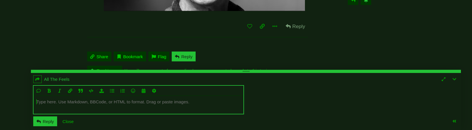
You can see how tiny it is… and I can’t get it to expand. I don’t seem to be having this problem on other discourse boards (the BBS or chinwag)…
It seems to fix itself if I log out and back in, with the box looking somewhat normal (but smaller than I’d like). But as soon as I try to drag it up, it goes into the above configuration… I’ll get a screenshot on that in a second and post it…
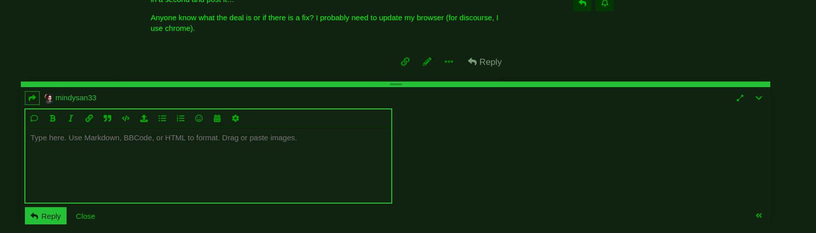
Anyone know what the deal is or if there is a fix? I probably need to update my browser (for discourse, I use chrome).
Okay, logged out and in… as you can see, it’s slightly larger here:
Okay… weird.. now it’s doing the opposite of getting too small?
But if I try to move it intentionally, it won’t let me?
And now I can’t see the reply button!
MEANWHILE… in another thread…
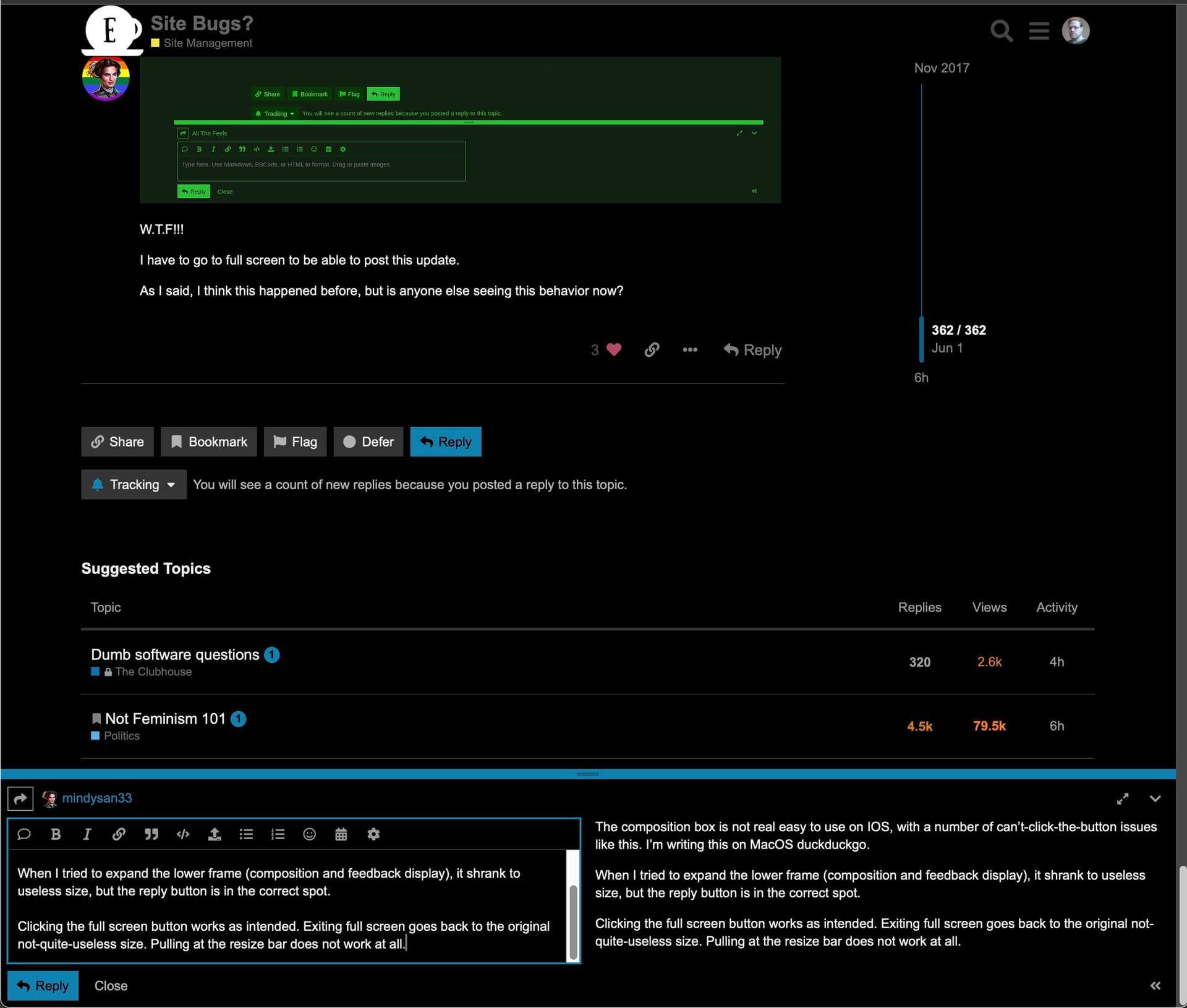
W.T.F!!!
I have to go to full screen to be able to post this update.
As I said, I think this happened before, but is anyone else seeing this behavior now?
4 Likes
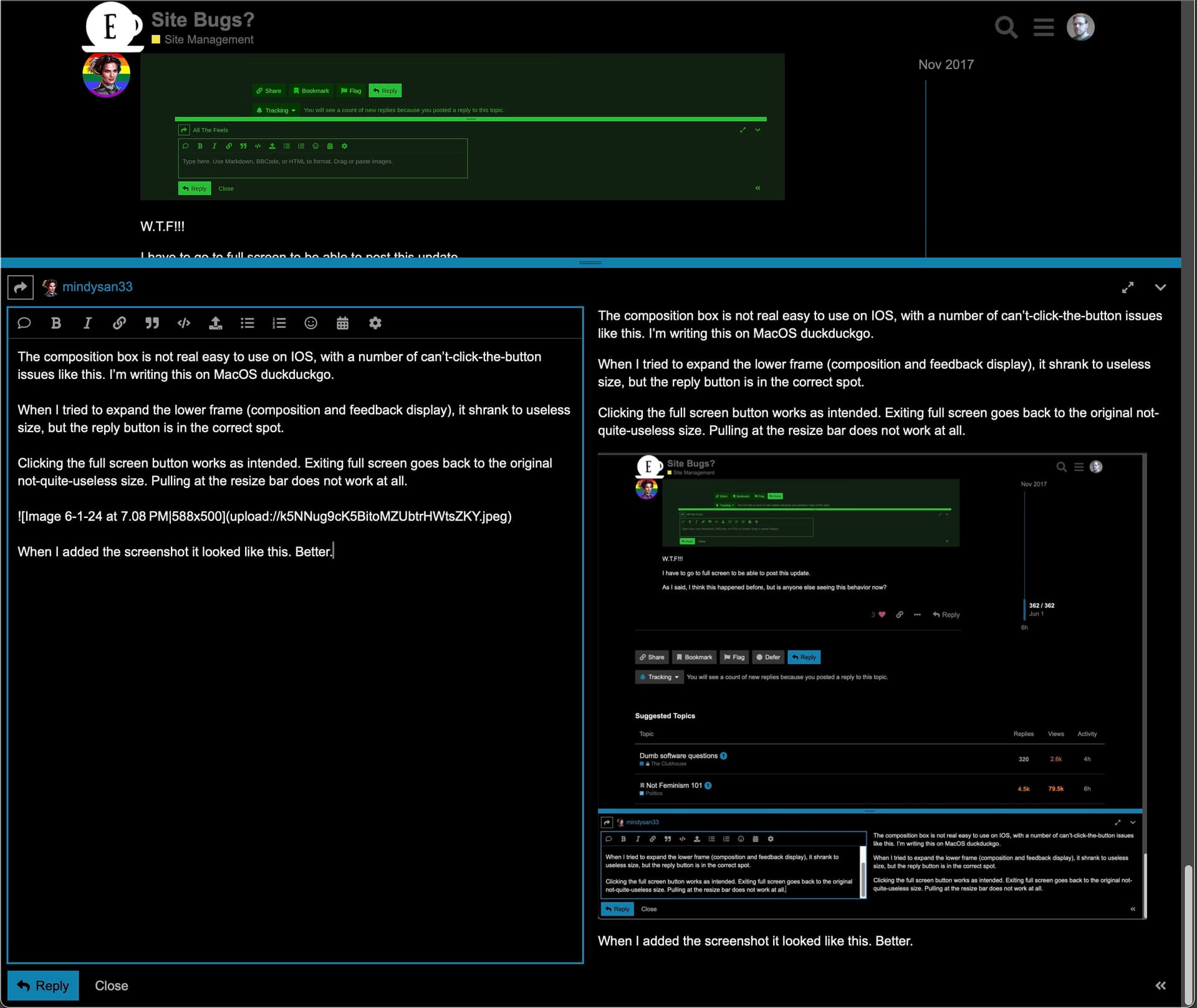
The composition box is not real easy to use on IOS, with a number of can’t-click-the-button issues like this. I’m writing this on MacOS duckduckgo.
When I tried to expand the lower frame (composition and feedback display), it shrank to useless size, but the reply button is in the correct spot.
Clicking the full screen button works as intended. Exiting full screen goes back to the original not-quite-useless size. Pulling at the resize bar does not work at all.
When I added the screenshot it looked like this. Better. Resize bar is immoveable.
Uploading the second screenshot expanded the composition / preview pane to nearly the full window (cannot read the thread at all). The resize control is still immobile. The Reply/Close buttons are inaccessible.
Clicking the fullscreen button brings the Reply/Close buttons back, but now the thread view is gone up off the top of the viewport. Gonna click it now while I still can.
5 Likes
I’m on redhat, and it looks like we’re having the same issue, generally speaking…
6 Likes