The business with the resize control not working has been true for months, if not a year or more. I have to use the full screen button (double arrow pointing at 2 and 8) to be able to resize an image or hit “reply” button.
The short answer is that I don’t know what’s going on, but that I’m affected as well.
It doesn’t appear to be theme specific, as @mindysan33 is on a different theme than @AndyHilmer and I. My best guess is that there is something in the customizations that are implemented here as compared to other Discourse sites that are somehow interfering with the post editor. Last time this was reported, I updated the Discourse version we’re running here, but it didn’t seem to resolve anything, so I doubt there’s anything to be done by updating it again.
@tinoesroho can you take a look at the custom code and see if there’s any way to disable it temporarily or in a separate theme so we can test how that impacts this issue?
In the interim, I’d recommend the same thing that @kxkvi and others are doing, using the full-screen interface to work around it until we can find a root cause and hopefully fix it.
Thanks for responding!
If something changes on my end, I’ll let you know if anything changes with my interface.
Wasn’t able to replicate the issue described. After reviewing theme customization CSS and our custom components (shared between themes) was not able to find a root cause.
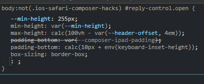
popping open element inspector revealed that the core discourse CSS base itself might be the fault here. as you can see, it tries to force a minimum height of 255px and sets the max height based on the header-offset * 4em. Maybe the site logo is causing the height of the header to be calculated as much larger than it is?

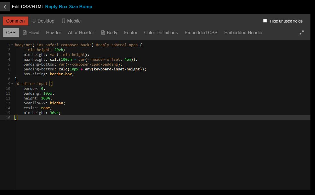
This isn’t pretty, but this should hopefully resolve the issue in pretty much all browsers. Somebody on iOS let me know if the reply box editor is still too tiny?
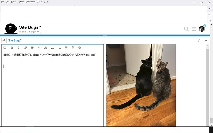
I’m still getting the same behavior in Firefox in Win 10. I uploaded a picture of our cats, but I couldn’t get to the image size (50%, 75%, 100%) without clicking the double arrow at an angle icon, nor at the “Reply” and “Close” buttons. Below is a screen shot (with personal stuff whited out). Note that I have scrolled down to the bottom of the window.
Also the double horizontal line in the middle doesn’t do anything.
I’ve narrowed down the draggie-resize-reply-view bug down to the Ignore User component we’ve been using since forever ago. I’m not sure why or when Discourse reply view busted while the component is enabled. We haven’t touched or changed the scripting since 2017.
I won’t have time to write migration code that moves ones’ existing muted users list to Discourse’s own implementation of an Ignore system (the type used on the other place) until 15th or 16th June this year. That’s like, in a week’s time? I don’t really know. Work’s got me brain scrambled.
Very sorry about the bugs, in the meantime.
Goodness, it’s no biggie! We’re lucky to have you.
Do you have any way of knowing how many people that’s going to impact? I don’t want anyone to have to lose that functionality, but it may be easier and faster to reach out to individuals to get them migrated if there are very few of them, instead of waiting for a general solution.
Also, is there any way to create a theme that doesn’t include that component so people can make a choice about which functionality to prioritize?
No idea how many would be impacted. The script was implemented with it running entirely user-side, in thr user’s browser. I could update the script to a
send a one-time roll call PM to a system account via user-side jquery click simulation as a stage in a longer roll-out.
It is possible to clone or create themes without the script-based system, in the meantime.
The size looks OK, but now the “Reply” button doesn’t work unless I hide the keyboard first. I can see the button, I can touch it, but it doesn’t do anything until I hide the keyboard. That’s new.
… if it’s causing problems, just remove it
It shouldn’t be that big a deal for us to switch to the other Ignored feature on our own if we need it that badly
Haven’t had any issues before this point, so I’m not sure if related, but I’m suddenly having issues with the text block in the reply area overlapping the buttons below, to the point that it’s difficult to hit the “Reply” button to close out a post. I don’t use the ignore component at all (have never hit the point where I’d want to ignore someone who wasn’t so egregious about causing problems that they would be moderated), so I’m not sure if it’s a data point or if it’s just expected from the troubleshooting that’s been done.
(using Firefox on Win11 if it helps)
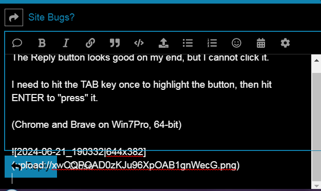
The Reply button looks good on my end, but I cannot click it in Chrome. It seems to work alright in Brave, though.
I need to hit the TAB key once to highlight the button, then hit ENTER to “press” it.
Text, etc, appears below the edit box in Chrome. Again, no problems yet in Brave.
(Chrome on Win7Pro, 64-bit)

Yep, that’s what I’m seeing on Firefox. There’s a narrow spot where I can hit the reply button when it’s doing that, but it’s sometimes tough to find… it seems like it’s only the area directly over the arrow that can activate the button, not anywhere else over the button, and if the text is overlapping then you have to hunt for a spot that’s over the arrow but outside the edge of the text.
Hmm… I happened to click-drag the handle of the bar at the top of the reply area (pictured below) while writing a reply for another post, and it immediately snapped to a point where the text area isn’t overlapping the reply button any more. It seems to be persisting for me also, and the entire reply button is now accessible when I mouse over it rather than just the arrow.
I’ve seen some weirdness since then with the size of the reply area being gigantic sometimes, but otherwise I haven’t seen the text area overlapping the buttons since then. Very strange. Aside from the immediate snap that one time, the handle on that blue bar seems completely nonfunctional for me… it switches to an icon which seems to indicate that it can move, but click-drag does absolutely nothing.
Confirmed. I just got the same effect on Chrome.
ETA: And the Reply button is clickable now, too.
Since I got that change while dragging the reply area, I’ve seen that any paste into the reply area expands the reply area upwards, and there’s no scroll available for the relpy area. This might be the same as the earlier reports of issues; if I paste something that is too large, the reply button is entirely off screen and I have to hit tab and pray to submit. I think I just haven’t ever hit something that triggers this, but it showed up in #DammitKansas - #65 by Nonentity
… well how about, if you’re not going to get rid of this redundant, buggy “mute” button, is there some way we can individually turn it off, so I won’t have to worry about accidentally clicking it again ![]()
The custom Ignore/Mute User component has been disabled site-wide. I apologize for any inconvenience this may cause you. Please use the built-in discourse Ignore feature instead going forward.

