14 Likes
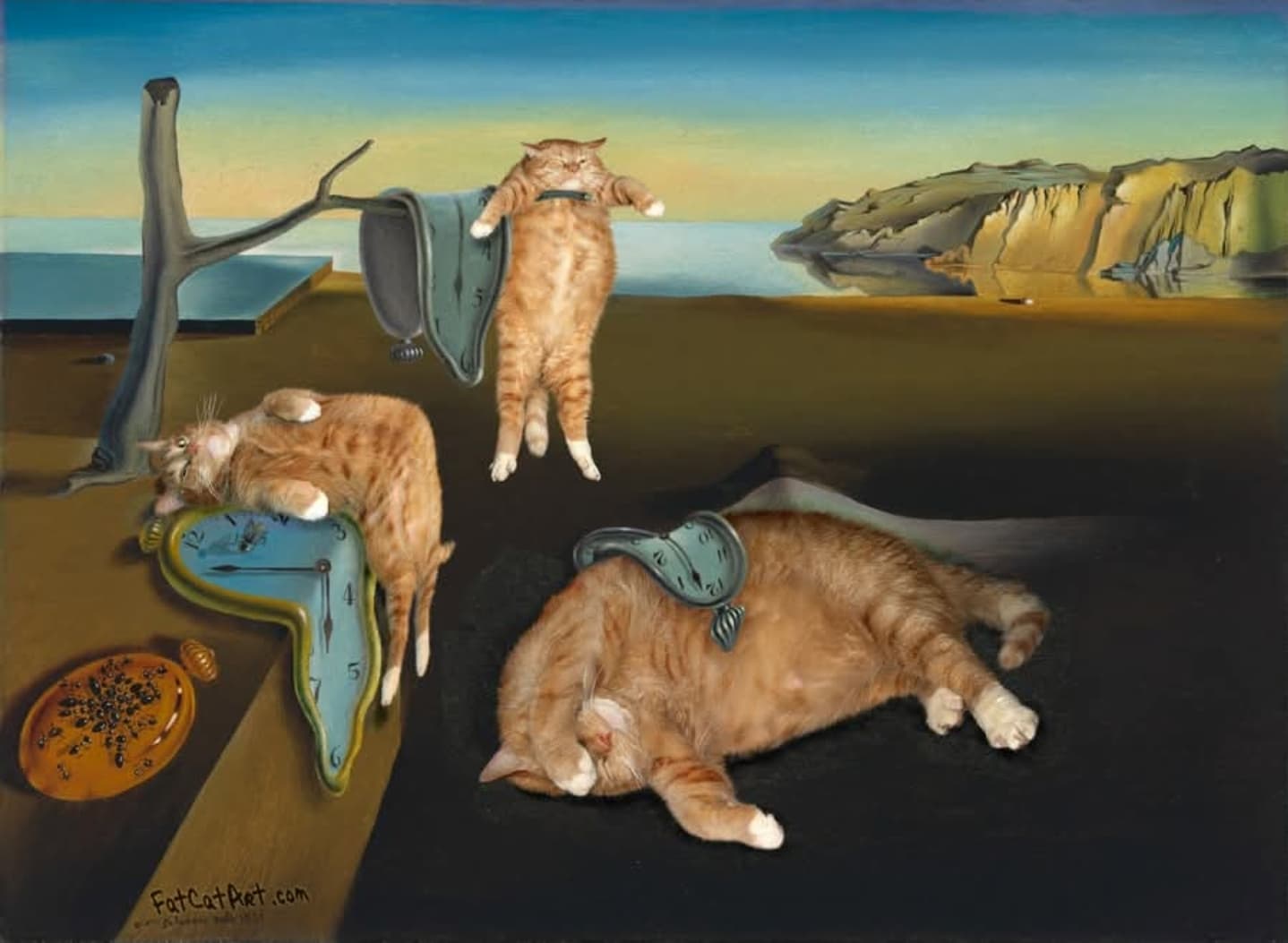
I agree. Holofernes’s head in the newly discovered painting looks like an afterthought, thrown in much later and not well painted at that when compared to Caravaggio’s 1598 painting which is much well sorted out and almost photo-like.
8 Likes
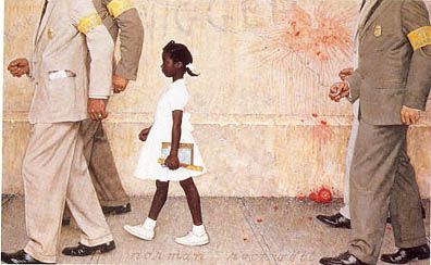
OK, the inverse of the average Norman Rockwell painting.
6 Likes
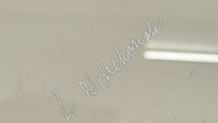
I need help in deciphering a signature on a piece I just bought (paid $50 for it, so I’m not invested in it being authentic to the period); Art Deco/Art Deco style. The signature is in metallic silver ink, which is suspect for real Art Deco.
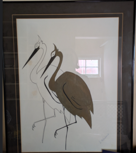
And the signature;
11 Likes
L. W. Hulurisk?
7 Likes
hmmm; I think the first letter of the last name looks like a “b” to me. L Wb luhorski? There are a couple of dots, but no clear "i"s, although the second dot looks more like an accent aigu in French.
8 Likes
It’s so tragic that kids these days don’t use cursive any more, so future generations will never know how wonderful it is to look at a written name and try to figure out how many letters it’s even supposed to have. ![]()
12 Likes
I blocked out just the illustrated portion then did an image search with then w/o riding L.W. along with the search, but nothing turned up except numerous other art deco cranes. Trying the same search but with the entire pic you posted resulted in the same thing. ![]()
9 Likes
Thanks! That’s more effort than I was expecting! Those are the same kind of results that I was getting with image search. I was hoping that if I could decipher the signature, I might be able to track down the time period. But it could be an unknown hobby artist, with no internet presence.
10 Likes
In all though, the illustration looks quite nice, period piece or not. ![]()
9 Likes
Yes, I do like it. If it’s authentic, that would be a bonus. Sadly, it does have a couple of coffee or tea drips on it.
10 Likes
9 Likes
12 Likes
11 Likes
11 Likes
Multiple sources b/c some have details the others lack.
OK, first of all, here’s the painting:
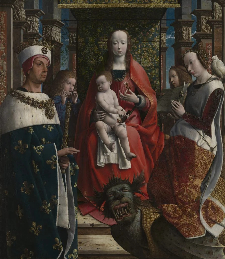
…and here’s some of what’s being said typed about it:
From the All That’s Interesting article:
“Excluding French candidates like Jean Hey, the style of the painting is reminiscent of Netherlandish artists like Jan van Eyck, Hugo van der Goes, and, especially, Jan Gossaert.”
“‘The dramatically foreshortened faces of the saints and angels are reminiscent of some of [Gossaert’s] early drawings,’ the National Gallery noted."
From ArtNews:
“It is painted on a Baltic oak panel, which artists from the Low Countries often used, while French artists preferred local oak. However, Saint Louis is depicted in the work, representing the French king Louis IX (1214-70), and his gown is embellished with the royal fleur-de-lis associated with the French monarchy.”
From ArtNet:
“Indeed, art historians see something of Jan Gossaert in the angels’ foreshortened faces and intensity of details suggests a familiarity with the work of Jan van Eyck and Hugo van der Goes. One wrinkle is the presence of the 13th-century French king Saint Louis, whose gown is decorated with the royal fleur-de-lis. The specificity of his facial features, including a scar running down his forehead, imply he is the altarpiece’s donor. As such, the possibility of a French painter has not been ruled out.”
From the Smithsonian:
“The first clues about the altarpiece’s origins come from the wooden panel it’s painted on. The gallery used dendrochronology to date the wood to around 1483.”
From All That’s Interesting:
“The gallery can’t identify the artist for sure. All they know is that it was probably painted around 1510, because the chain of the Order of Saint Michael worn by Saint Louis was modified in 1516. It was first documented at the urban priory of the Premonstratensian Abbey of Drongen in Ghent in 1602. While it’s unknown if the painting originated at the abbey, the Premonstratensians did revere Saint Louis and a swan, which appears in the painting, was also in the monastery’s coat of arms.”
13 Likes
9 Likes
A profile of environmental artist Tom Deininger and how he transforms discarded objects:

10 Likes