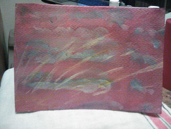
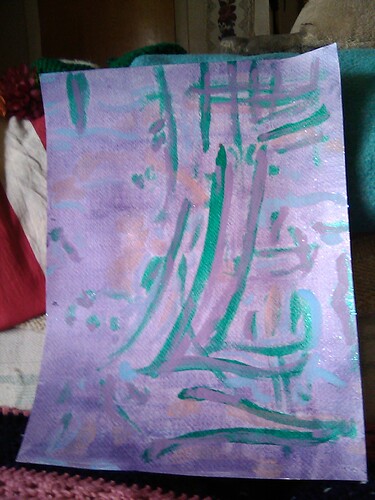
Which orientation?
Top
Free/pay-what-you-want on Bandcamp. Inspired somewhat by the paradox of relaxing to tales of horror and the paranormal.
I recorded slightly longer improvisations and mixed them continuously with transitions to build up larger pieces – I really enjoyed the process and I think it makes for a nice balance of continuity and contrast 
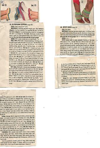
I love the spats! Very 80s vibe.
But I can’t follow a pattern like that. Mental block, attitude problem, or just like… I crochet for fun, not to count and recreate someone else’s knots. If I can figure out how to do it myself, I can make something, but I’ve made a lot of funky and fucked up garments along the way, because I don’t enjoy following directions. But I could look at crochet photos for hours, for inspiration.
My mom could look at certain items and figure out how to make them herself. She was very clever that way.
I know, they are interesting to look at, especially the ones from the 1940s and 1950s.
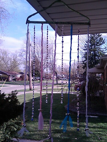
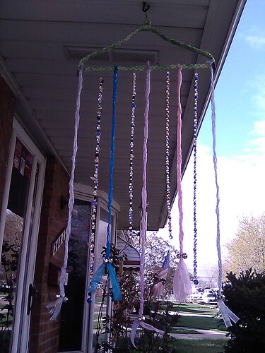
Is it a wind chime?
Sort of; there are jingle bells at the ends of the ribbons. But it’s mostly pretty-shiny to look at.
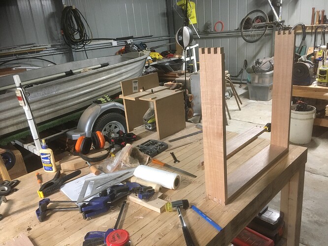
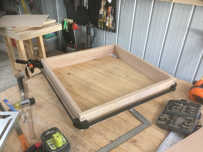
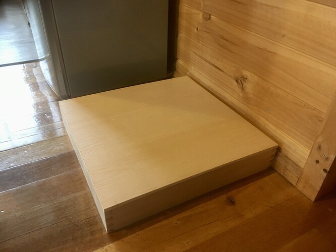
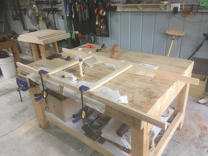
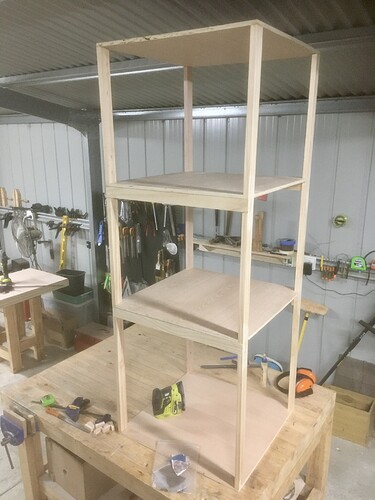
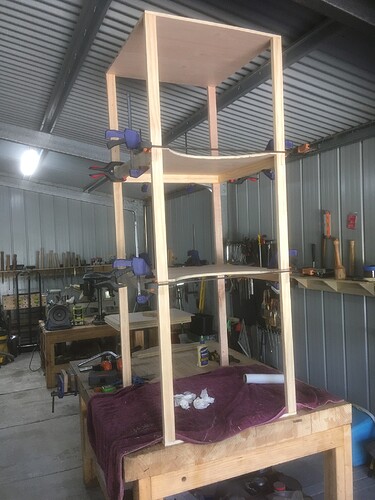
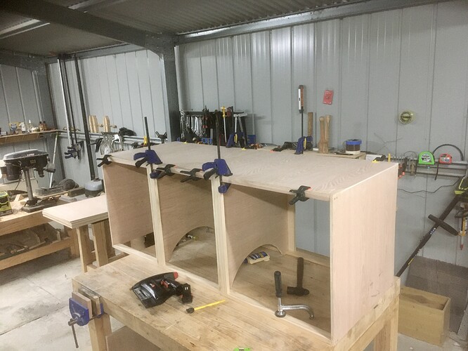
Halfway through making a pantry cupboard for my kitchen:
Still to do:
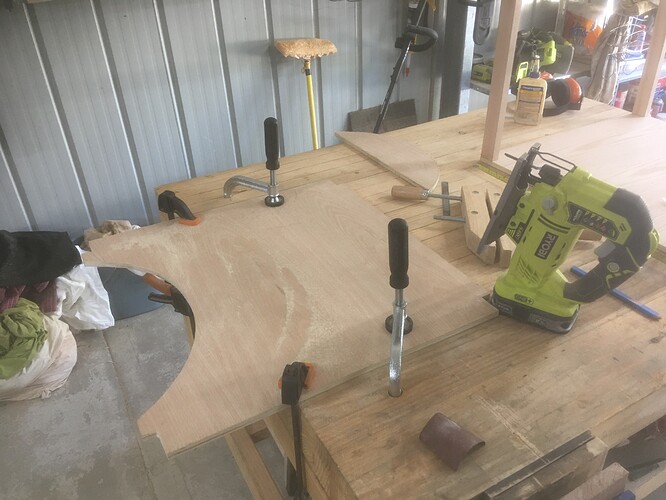
- Cut an arc into the front of each shelf to make it easier to access the lower shelves.
- Skin the whole thing in 7mm plywood with a red oak facing (like the shelves, but thinner).
- Make a door from pine and more red oak plywood.
- Turn a doorknob on the lathe.
- Add mouldings to cover the joins in the plywood skin.
- Mount the cabinet onto the Tassie Oak base and secure it to the wall.
Does anyone know a trick to lighten color from pdf comics without lightening lines and writing in them?
Is it vector art?
You would probably have to open the PDF in Illustrator, move all black fills and lines to their own layer, then adjust the color layer as needed.
It’s raster. I wonder if there’s a way to adjust the brightness/saturation curve, or use white point and black point in some way.
In that case, you can open the raster graphic into Photoshop (there are a few ways of doing this) and lighten the image using Levels. That should only affect the midtones but not the white or black levels.
That would a first step to try anyway.
I don’t have Photoshop.
I tried using k2pdfopt to tweak gamma, but it downsamples writing, and ends up with gray, and when it applies the gamma adjustment, it lightens that with the rest.
It looks like Ghostscript dropped support for gamma.
Are you using a Macintosh? “Preview” has Levels.
I’m using a Mac. I have Preview. I don’t know what levels are.
Standard advice is to use “Adjust Colors” in Preview to adjust colors, but that’s not available for pdf, and converting to hundreds of tiffs and back is ridiculous.
I think Colorsync has options, but I can’t find documentation for the options, such as “bilevel.”
