14 Likes
8 Likes
7 Likes
We are known for large families
16 Likes
16 Likes
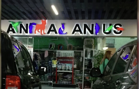
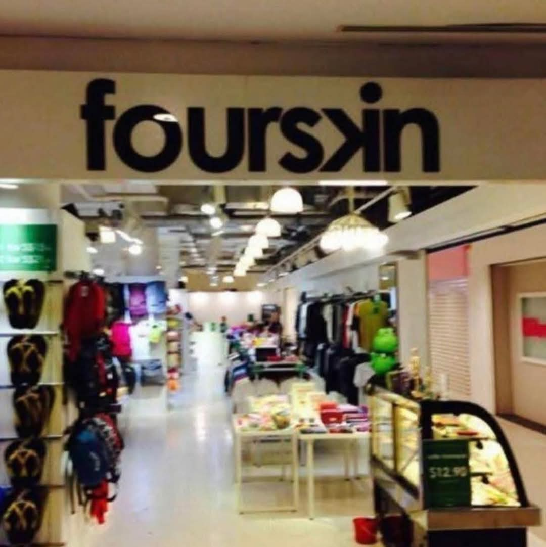
I mean, it’s got it all - graphic design/font issues (animal shapes of random sizes representing letters with varying degrees of identifiability), kerning issues (with basically random amounts of space between letters in words and between words) and generally inconsistent logic (it starts with a letter and animal shape meant to be ignored, pivots to animal shapes being letters, then throws animal shapes on top of letters just to further confuse things) - making it unreadable.
13 Likes
10 Likes
12 Likes
15 Likes
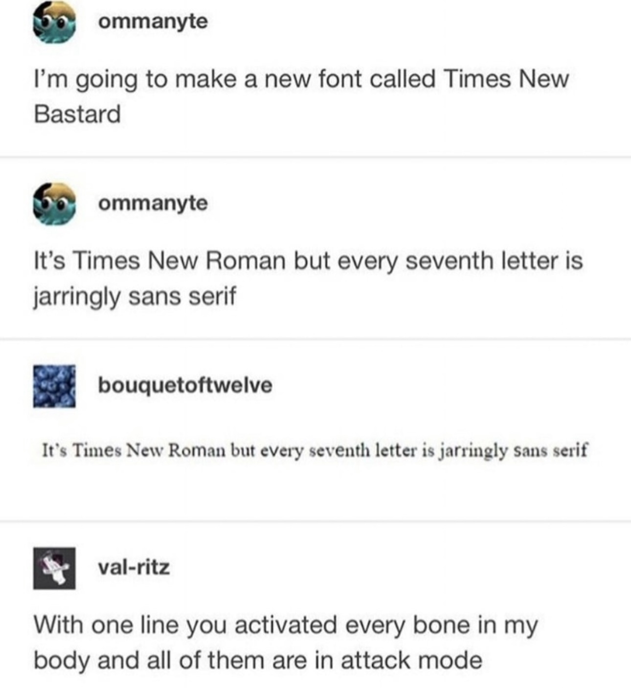
Yeah, I expected that to be a clever joke on bastarda, tbh
7 Likes

17 Likes
It’s kinda practical when idiots label themselves in a clearly visible and permanent way.
11 Likes
More of them should get them in easily-spotted bodily locations, such as the forehead/face (granted, damn near any forehead/face tat is an immediate giveaway) or neck.
Once took a bus trip in Ontario, CA sat behind a chap w/a neck tat. It said ONTERIO in some wretched fake olde-timey blackletter font, surrounded with ridiculous olde-timey fancy scrolled flourishes. After he disembarked, I mentioned it and its missspeling to my BF. He informed me, in all seriousness, that that’s actually how the Onterio gang of Ontario spells/-ed its name.


12 Likes
7 Likes