There is a version where it gets better. But seemed like, while not directly related, it fit with @Millie_Fink 's post.

There is a version where it gets better. But seemed like, while not directly related, it fit with @Millie_Fink 's post.
Ah, the good old days.
")
A YouTuber on a video I watched recently commented how Blendtec got bought out by another company. Not surprising but def when I think about Will It Blend it gives me nostalgia.

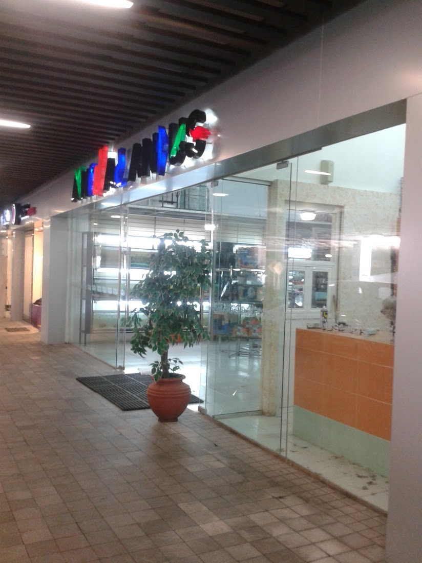
Graphic design is my passion, part one million:
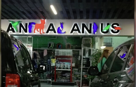
Oh, it’s my favorite shop, “Ana Anus. Er, Anima Anus? Uh, Animal Anus? Oh, Animal Anius!”
Good god, that logo needs to be in one of those “top ten worst designs” lists. Maybe even in first place. I literally could not guess what it was supposed to say.
Yeah, I couldn’t get it without help. There’s just so many things working against legibility here. The animals-as-letters aren’t of consistent shape or readability (the toucan isn’t very readable as an “i” but it’s also wider than the fish that’s supposed to be a “d,” making the fish read better as “i”; the dog as “m” is huge and not a very good “m,” and the cat brings into question all the other letters because it’s so much more readable as an “L” than anything else is). Kerning is, well, basically ignored, which isn’t helped by the inconsistent logic of the design. They destroy the possibility of internal logic right off the bat by having two legible letters between an animal shape that you’re supposed to ignore, which also creates a huge gap between the letters, and then it’s followed by animals-as-letters that overlap each other. After using huge animals for letters, the fish isn’t nearly big enough to read as a “d” and there’s not nearly enough space for the “an?us” to be read as two words - especially as, given the “rules” established at the beginning of the sign (two letters forced apart by an animal shape to be ignored), it should be read as “anus.”
On top of all that, it doesn’t help that the shop name doesn’t make sense. “Animal and Us”? Animal, singular? What!? What animal? (It makes it sound like the animal is a metaphor - our animal nature, or something.) “Animals and Us” isn’t necessarily a great name, but at least it makes some sort of sense. So you’ve got to fight inconsistent visual logic, bad design and kerning, to try to decipher a name that isn’t at all obvious.
I really wanted to guess that this was faked as a joke, but no, here’s another angle. It seems to be in Mexico, if that helps?
I did wonder about the odd name with the (singular) Animal And Us, and if it was made by someone for whom English was a second language in a primarily English-speaking country, but it still seemed odd if the presumably English-speaking audience wasn’t constantly pointing out that it was easy to (mis)read as “anal anus.” I guess that would explain that bit, anyways. (Though if the intended audience is speaking English as a second language - or not at all - the difficulty in parsing it becomes all the more baffling, as it would be even more difficult to make sense of.) The general graphic design disaster nature of it remains, of course…
Maybe they were trying for “Animals R Us” but they were afraid of being sued?
Well I think it’s a great name–for a different business though.
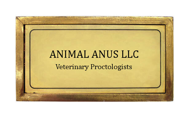
It was going to be either proctologists or hot dog makers.
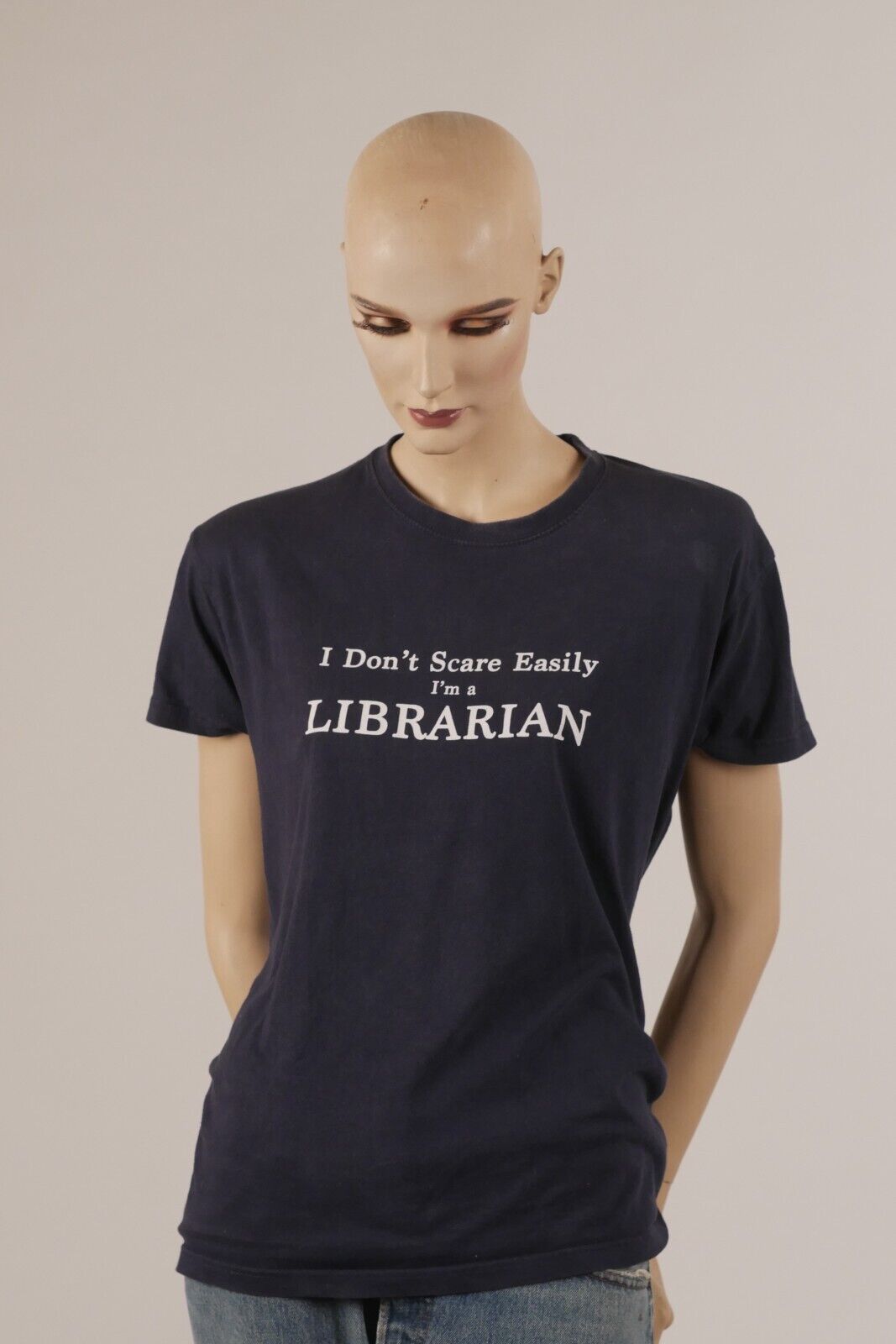
Never mess with an Auton librarian.

Yeah - look it up!