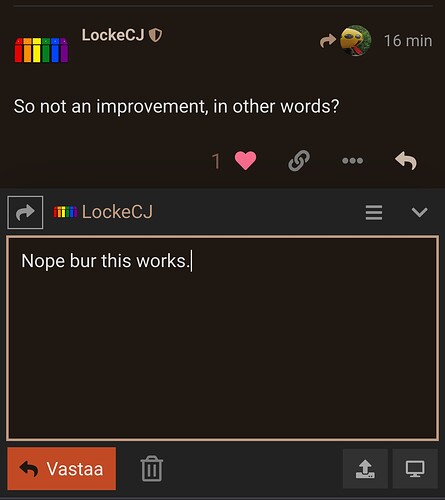
The desktop version seems a lot better to me, nothing overlapping when the text box is resized and proper hit boxes on the reply and close buttons.
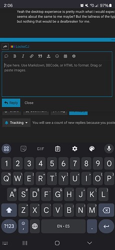
Yeah the desktop experience is pretty much what i would expect it to be, so great fix. For mobile it seems about the same to me maybe? But the tallness of the typing area on my phone is an annoyance but nothing that would be a dealbreaker for me.
Good to know, thanks. I may dig into some of the other components and see if there’s anything that makes a difference for mobile. I’m just pulling levers, as I don’t yet have an understanding of how the components all work yet.
This is what the site looks like when typing on Firefox mobile with desktop enabled. Looks correct
This is how it typically behaves. I have to scroll all the way up to even see what i’m typing and then scroll all the way down to hit reply
P.S: As mentioned, it’s an annoyance but not critical. Feel free to poke at it when you’ve got time
This isn’t really a “bug”, just a question / suggestion – is it possible to merge topics?
Here are a few candidates; I know there are more.
and
Also:
and

Yes, but it tends to only happen if the original poster requests it, or I suppose if enough people request it. My recommendation would be to reach out to the topic creator and see if they are amenable to merging the topic, then have them request to staff or TL4 to merge their topic into the other.
Also, I’m not sure if I agree that the first pair of topics is necessarily a match, but that’s the nature of taxonomy.
Also also, I got a bit of a chuckle that you asked your question in this thread rather than this one, given the topic:
No harm, of course. I’m happy to help wherever.
It’s fine, not a big deal.
I assumed merging had to be done by admins, which is why I didn’t post to “How do I…?”
I should just let go of my preference for lumping over splitting
What’s going on here? I got a notification that @KeybillyJefe mentioned me in a comment:

But when I follow the notification link to the comment, I’m not mentioned there at all. I thought it might be that Jefe edited his comment to remove the mention, but aren’t edited comments marked as such?
I just tried to do a search and got this:
“An error occurred: Site is under extreme load, search is disabled, try again later”
ETA: It worked the second time.
i tagged you by mistake and changed it immediately, before the “edit timeout”.
weird that it still pinged you.
I figured something like that. It looks like the bogus notification stays in place permanently, and the notifications lists we see are not updated retroactively.
Once or twice at the other place I got a notification of a “Like” from someone, but there was no “Like” from them on my actual comment.
And once or twice I myself “Liked” a comment and shortly thereafter removed it after reconsidering, and hoped that the person wouldn’t notice ![]() ('cause it seems a lot worse to remove a “Like” than never to have “Liked” at all…)
('cause it seems a lot worse to remove a “Like” than never to have “Liked” at all…)
Sometimes I’ll like a comment and then my finger quickly touches the heart again, removing the like. It’s so sensitive. ![]()
I’m sure that I’ve missed a few of those and accidentally removed a previous like at TOP.
eta: I liked your comment…make sure it’s there
Yes, I would like to know if this is possible, too.
We need a good food and drink topic.
We had a good one on Boing Boing bbs.
Didn’t you already start one?
I’m pretty sure I even posted to it recently
Yes!
I started this one on day one on this elsewhere.cafe site.
The answer was about combination of the two food posts into one.
Please keep sending your eats and drinks in.
I guess there’s not a font size setting here?
It shrunk a lot overnight for me here, though not on other sites. Fiddling with font size in my browser and in my phone doesn’t enlarge it. ![]()
haven’t noticed that here on my android phone using duckduck as my browser(?)
used to get that a lot over at TOP.


