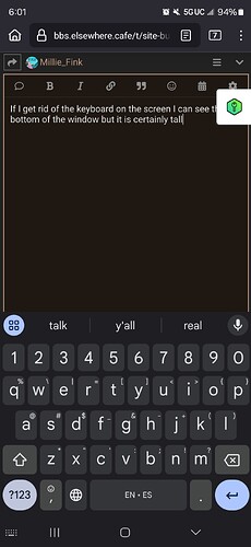
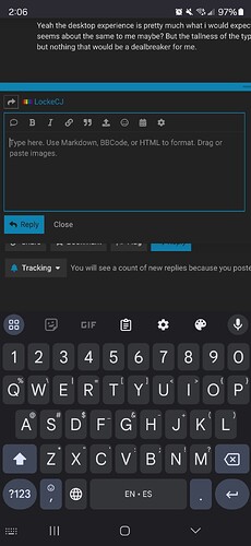
If I get rid of the keyboard on the screen I can see the bottom of the window but it is certainly tall
Ran into a weird one just now. Played a bit of a couple of videos on the Jukebox thread, scrolled some and they unpaused.
Firefox 132.0 64-bit Windows
That used to happen to me all the time at the old place. It got to the point that I just refresh the page after playing a video. ![]()
It might be worth trying a different theme to see if you get different behavior. Profile → Preferences → Interface → Theme.
I’ve never messed with any of the custom themes in Discourse. I think @tinoesroho created several of the ones here.
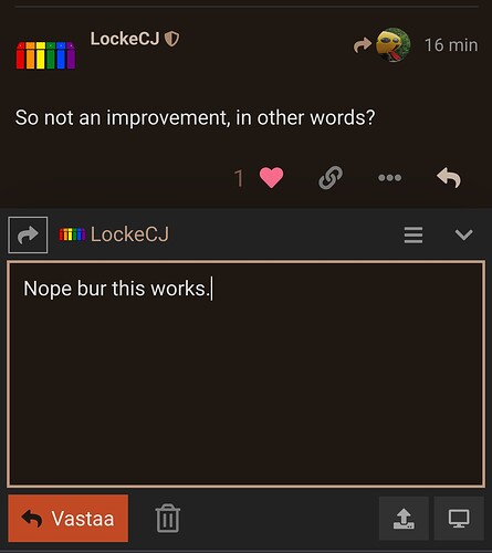
I think I may have solved some of the compose box issues. As I was replying to a DM earlier, it occurred to me to try on a vanilla Discourse install for comparison. The compose box did not extend past the buttons, and the hitboxes for the buttons were consistent and predictable. This reminded me that we disabled the Ignore User custom component a while back to try to resolve a similar UI issue, so I investigated and discovered that there was another custom component installed/enabled that was named Reply Box Size Bump. While I’m sure it had a distinct purpose at some point, I suspect Bitrot has made it incompatible with more recent versions of Discourse, so I went ahead and disabled it. That seems to have fixed the box sizing issues, as well as the reply/close buttons. If you are still seeing the broken behavior, try refreshing the page. Please let me know if you see any other issues, but I think things are at least improved a bit.
So not an improvement, in other words?
The desktop version seems a lot better to me, nothing overlapping when the text box is resized and proper hit boxes on the reply and close buttons.
Yeah the desktop experience is pretty much what i would expect it to be, so great fix. For mobile it seems about the same to me maybe? But the tallness of the typing area on my phone is an annoyance but nothing that would be a dealbreaker for me.
Good to know, thanks. I may dig into some of the other components and see if there’s anything that makes a difference for mobile. I’m just pulling levers, as I don’t yet have an understanding of how the components all work yet.
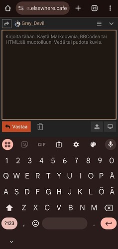
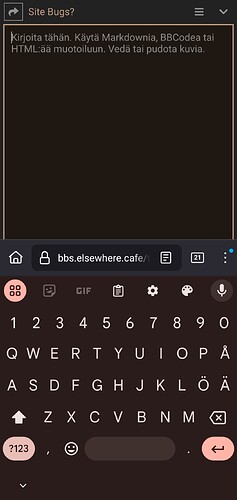
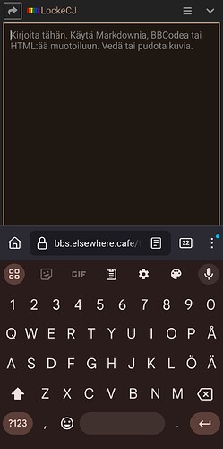
This is what the site looks like when typing on Firefox mobile with desktop enabled. Looks correct
This is how it typically behaves. I have to scroll all the way up to even see what i’m typing and then scroll all the way down to hit reply
P.S: As mentioned, it’s an annoyance but not critical. Feel free to poke at it when you’ve got time
This isn’t really a “bug”, just a question / suggestion – is it possible to merge topics?
Here are a few candidates; I know there are more.
and
Also:
and
Yes, but it tends to only happen if the original poster requests it, or I suppose if enough people request it. My recommendation would be to reach out to the topic creator and see if they are amenable to merging the topic, then have them request to staff or TL4 to merge their topic into the other.
Also, I’m not sure if I agree that the first pair of topics is necessarily a match, but that’s the nature of taxonomy.
Also also, I got a bit of a chuckle that you asked your question in this thread rather than this one, given the topic:
No harm, of course. I’m happy to help wherever.
It’s fine, not a big deal.
I assumed merging had to be done by admins, which is why I didn’t post to “How do I…?”
I should just let go of my preference for lumping over splitting
What’s going on here? I got a notification that @KeybillyJefe mentioned me in a comment:
But when I follow the notification link to the comment, I’m not mentioned there at all. I thought it might be that Jefe edited his comment to remove the mention, but aren’t edited comments marked as such?
I just tried to do a search and got this:
“An error occurred: Site is under extreme load, search is disabled, try again later”
ETA: It worked the second time.
i tagged you by mistake and changed it immediately, before the “edit timeout”.
weird that it still pinged you.
