As far as I can tell, the user profile image bug has been resolved. Let me know if it’s still not working.
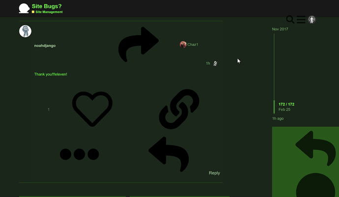
Massively large icons in Retro theme fixed by clearing cache.
Same here, no easy way to clear the cache on iPad. Had to switch to mobile view in order to be able to post at all.
On my android, using the Brave browser, had to clear the cache on the app level (so, press the icon on the screen, choose the app info button (i in a circle), scroll down to storage, and clear the app cache). Clearing the site cache in the app did not do anything.
If you go Settings → Safari → Clear History and Web Data that should do the trick.
Thank you! I can now dial my panic level back to normal.
In Firefox, Clear Recent History, time range Today, got rid of the huge icons without clearing all my history.
Thank you!!!eleven!
Even after clearing your cache or reloading and bypassing cache (shift-refresh)?
The “mute this user” icon has become invisible?
Default Dark seems to eat the Mute User theme component. I’ll have it restored as soon as I can.
Update:
Fixed. May require a cache refresh.
Nope, not fixed. FWIW, I use the Light theme.
I tracked down the issue to a breaking change introduced in, you guessed it, Discourse 2.2-release.
I’ll have to patch the theme component tonight. Annoying but not the end of the world. In the meantime there is a teeny unlabelled button you can use to access functionality.
I’m pretty sure that’s also what was causing the gigantic icons for everyone earlier.
after much tribulation and cursing I’ve determined that the “correct” way prescribed by the Discourse devs is a royal, unportable pain in the actual neck.
just went ahead and used images. for now, it works. i might convert them to SVG later to see if byte savings can be established. but right now I’m just feeling tired.
documenting changes to code isn’t enough - devs need to communicate when change occurs
EDIT:
for those of you not seeing it, don’t worry - your cache should rebuild in the next day or so. if you really need to use the mute button in the meantime, you can force a refresh. if something’s more serious, please poke a mod.
EDIT2:
hilariously, theme components don’t work nearly as well as the old “incorrect” method.
edit 3:
really hacky but I’ve got it consistently working. essentially we pre-cache the mute button on initial site load.
Upstream:
I get giant icons when I visit this site on my old computer. And the icons entirely block the reply window, so I can’t post from there.
Clear your cache and it should correct that issue.
Ah, thank you!
It’s been about 10 days now, and this is what I’ve observed about the latest release:
- it’s slooooowww. Mostly I go here on my phone, and even on wifi it’s so slow I tend to avoid updated topics until they have a few replies in them. I’ve noticed I hit the reply button more than one now because it takes so long for the message window to appear, I think I mis-tapped. I don’t think this is a hardware thing. It seems to be client side if anything. At first I thought it was because our threads are so long, but brand new topics are the same.
- the way the avatar icon with one’s notices appears and disappears is super-annoying.
- the notices pane covers so much of the screen (and I have a big-screen phone) that it’s difficult to tap off and make it disappear.
I know others have mentioned a less than warm reception for user feedback in Discourse-land, but is there anywhere to report this stuff?
