It isn’t working anywhere for me.
Well that’s a disappointment.
I’ll look into whether there’s something I can do on my end as I get a chance.
I’ve reported the issue on the github, with a sample page.
Things have definitely speeded back up, both on my iPad and PC. Thanks!
Help!
I am new here. I’m sorry if there is a FAQ I haven’t seen.
Is there a way to mark a subject as “already read” so I only see new messages in the future? There is so much here that I could never read through it all. Or is there a way to sort to newest at the top? It looks like the subject list does that automatically but I can’t figure out how to do it for the messages in any one subject heading.
If I use the Summarize This Topic button does it just show me the messages that have the most hearts?
Is there a way to locate a specific topic? I was looking for site help but when I search it shows me everything that has site or help in it.
Is there a purpose to the “badges” I keep getting?
Hi, and welcome to the, uh, Elsewhere Cafe!~
My recommended reading view is Latest View, accessible via this link (or via the “latest” button on the homepage). https://bbs.elsewhere.cafe/latest
Summarize is a feature from the software we use. It shows the most replied, most linked to, and most hearted - in a mostly chronological order.
To locate specific threads or whatnot, use the Search tool!
https://bbs.elsewhere.cafe/search
As far as badges, yes and no. Most of the badges won’t change the amount of content you can see. Certain badges (gained via consistent behaviour, automatically assigned) will grant you access to more content.
There are quite a bit of interesting threads out there, depending on the type of content you’re looking for. I recommend checking out our blog category.
https://bbs.elsewhere.cafe/c/blog
obligatory self-plug
Since you’ve moved up to the “rank” of a Basic user, you can send a PM to the lovely @discobot to start a New User Tutorial.
If you click (or tap if you’re using mobile) your avatar on the upper right, you’ll see an icon that looks like an envelope-- that’s the Private Message icon. Send the following message to @discobot:
@discobot start new user
and it will walk you through tips and tricks of Discourse and Markdown. It’s fun, too!
Edited to add: when you’re done with the first tutorial, @discobot start advanced user will begin part 2. I thought it was mentioned at the end of part 1, but I don’t think it is.
Hi! To find out what I can do, say @discobot display help.
Ask again later
It figures!
At first they’re to encourage use, which is why you tend to receive a flurry of them at the beginning. Once you’re well-established here (time + participation), they don’t get awarded as often.
@discobot is a decent tutorial bot. Otherwise, feel free to ask questions, especially if you see people using features you’re unaware of or seemingly pulling off the impossible.
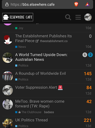
It’s kind of automatic, kind of not. If you just hop in and out of a thread, it won’t automatically kick in, but if you post a reply or spend enough time in a thread, on the main page the number of new replies will be noted as blue¹. Replies that are unread but not new will be a grey circle. Topics you have completed reading will be faded.
At the bottom of the comments is a box that will read “tracking” or “normal”. There you can manually set a topic anywhere from “Watching” (get notified of new comments) to “Muted” (you never have to see it again).
So if you set your preference to “latest” as @tinoesroho suggests, you will not only see the most recently updated, but you can tell what you have and haven’t read.
And if you don’t want to ask the crowd, you can Direct Message someone. Click on your user icon at the top right hand corner of your screen, and the envelope will take you to DM. Only you and the user(s) you’re talking to will be on the conversation (possibly site admins, too, but that’s true on almost any site). Honest, we don’t bite. Much.
¹ Depending on what colour scheme you’re using. Grey and blue are default.
On Chrome on Android…
Recently I tried to post a new topic and it was decided it was similar to a older topic.
I wouldn’t have minded this but I could not dismiss the pop-up saying it was similar.
Had to cancel the topic to get it to go away.
Annoying.
The behaviour of the notification counter in the title bar has changed.
Before, it would show updates to the specific page I was on: if I was on “Latest,” it would show how many updated topics were waiting to be refreshed; if I were in a topic, it would show how many new replies had been posted since I last viewed the page.
Now, it seems to just count the number of notifications directed specifically at me (the same as the counter on my user icon in the top right corner).
If possible, I’d like to revert to the previous behaviour. I don’t need my window title to be updated if someone has liked one of my posts, but if someone has posted something new, I’d like to be notified so I can read it.
This seems to be an upstream change.
The usual suspects don’t seem keen to uh, revert it. It might be possible to restore via javascript. I don’t currently have the spoons or available time to develop the script, though. ;-;
/EDIT: fixed in latest beta
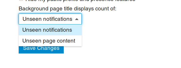
Looks like they’ve already fixed it as an option in the settings-preferences-interface menu:
I’ll have to look at it again the next time I’m in a desktop to see if that’s righted it.
Thanks!
Thus us the first time in a few weeks I’ve been able to access the site on mobile ( Android, firefox) in two weeks. Somethin’ change?
I’m not aware of any changes that should have impacted that. We’re due for an update, but I haven’t applied it yet. Maybe there was an update to the mobile app?


