The Art Thread

I love Rockwell. I love that he shows people with dirty clothes and their socks falling down, in old shoes which area probably handed down from an older sibling or borrowed from a guy they know who’s currently crouched in a foxhole somewhere, and still, they are in the middle of something important and they are ON it.

For all he potrays them being a mess, he’s respectful of them and elevates the mess to having purpose. That one of the little girl walking to her integrated school – she’s immaculate in white, but not only did that mess of a rotten tomato miss her, it’s behind her in the photo.

Or the two young women in the last picture, who thought to lay a blanket down on the road as they made their car repairs, which only makes the guy up on the hill even more of a contrast.

10 Likes

I’m gonna talk about one of my own pieces that I recently finished. If that doesn’t interest you, you may quit reading if you like.

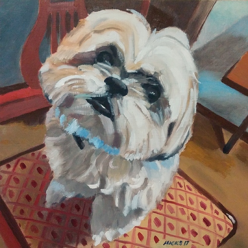
This is a little 12"X12" piece, one out of of three, that I did for a friend in San Diego. If any of my work survives after my death, I hope this one is a work I’ll be remembered for.
I know it may not appear to be much, but I’ll describe how it came about and hopefully give some insight into how I look at paintings and how I construct my own.
A little background…this is Coco the shih-tzu. He’s one of few dogs I feel I can actually connect with (dogs do like me, but I’m not really a dog person) because he’s a little low-energy couch potato and very laid back. He doesn’t bark or jump on you, and is very sweet.

Let’s start out at 15-20 feet away. First, I cannot take credit for the reference photo this was painted from. Coco’s owner took this shot, but I love how the composition works. I noticed this immediately.
The thing that I notice first is the geometry of the composition. Straight lines and angles surround the soft curved shape of his body and and fur. He’s a little bifurcated heart shape within a sunburst pattern (part of the background behind seen in the floor and the cabinet behind him). I see repetition in the echoes of the angles and curves.
I chose to alter the coloring to fit something close to a square color scheme, with a very earthy green, alazarin crimson, mustard yellow/orange, and blue. The natural colors are similar, but had a great vibe that reminded me of some of the muted color harmonies of a few of my favorite painters from the first half of the 1900’s, like Walt Kuhn.

Closer in, about 10 feet away…I tried to keep a slight expressionist feel without losing a sense of realism. Again, influences are Kuhn, Leon Kroll, Don Bachardy, Matisse. I tried to keep myself from using small brushes, and refused to let myself get bogged down in minute details. I also tried to employ a loose, impasto stroke that feels natural and not overly-controlled.

Five feet in…Here is where I utilized a few sparse details, like gently highlighting the reflection in his deeply buried eyes. It’s my hope the viewer can sense the intelligence there.

I hope this hasn’t seemed too much like mental masturbation to you all, but I think the breakdown of my paintings is something I’m going to try posting to Instagram and see if people like it.

ETA: Is anyone tilting their head as they look at this? I find myself doing it. It draws you into that gaze with his nose being the central point.
17 Likes

Love your painting & explanation. The latter really helped me to appreciate the former.

Makes me want to meet the puppy!

5 Likes
4 Likes

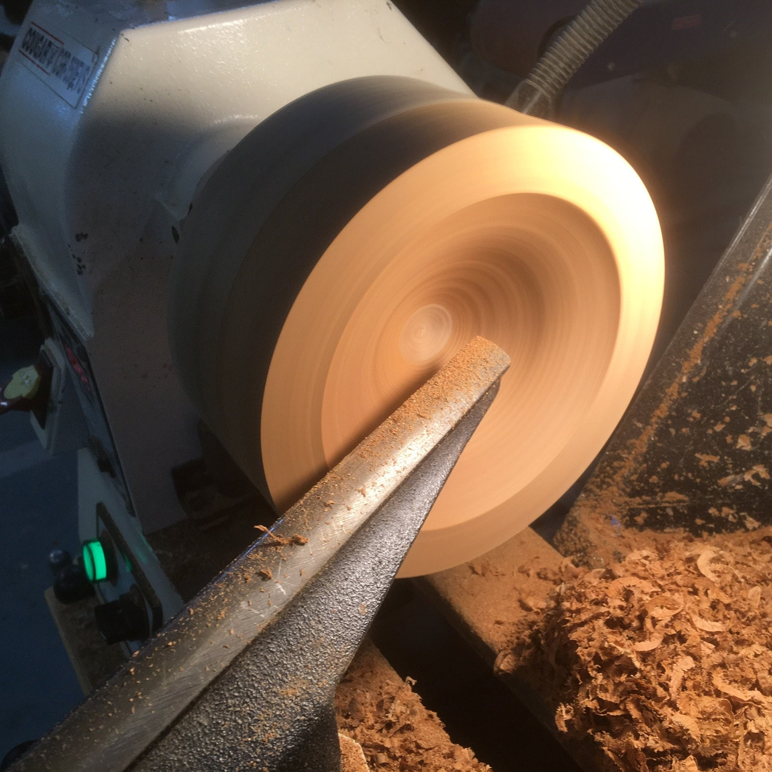
Still fiddling about with the lathe.

13 Likes

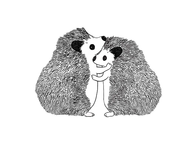
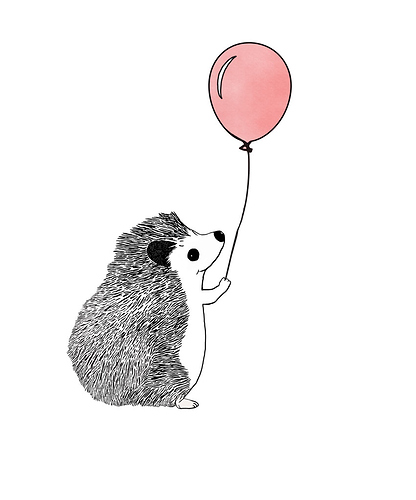
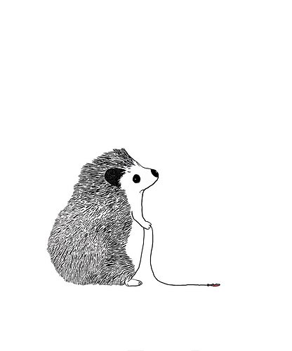
I’ve been working on line art a lot lately, and am getting better I think.

Hedgehugs

What could possibly go wrong?

Oh.

22 Likes

I love reading the thought processes/inspiration behind the work. It’s inspiring and brings another level of life to the work.

4 Likes

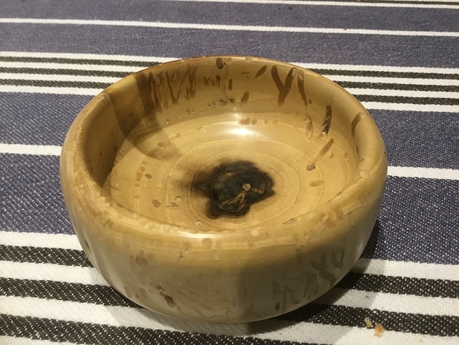
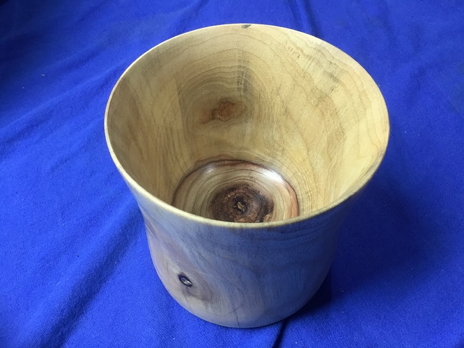
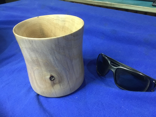
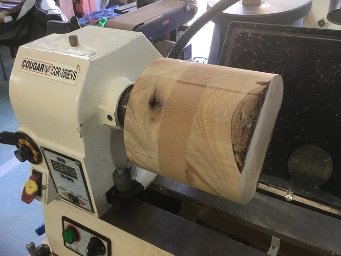
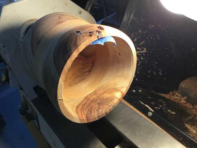
Playing with the lathe again:

Spalted pistachio wood, from my Dad’s yard. Bugs/fungi killed the tree (henced the spalted-ness), so we’ve got a whole tree’s worth of it.

9 Likes

There’s a children’s book in there somewhere. Keep going. Super sweet with the balloon.

6 Likes

Turning again…

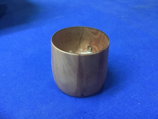
Camphor Laurel, roughly 5 inches tall and wide.

9 Likes

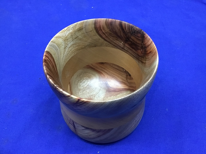
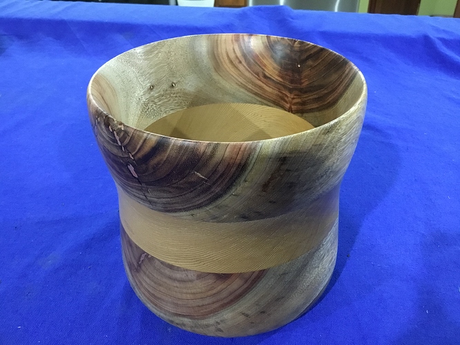
Camphor Laurel / Western Red Cedar / Camphor Laurel, about a cubic foot. Copper filled in the flaws near the rim.

9 Likes

Just getting started, so it’s a bit bare-bones for now and the prices are likely to need some finetuning, but here it is:

Advice appreciated if anyone has any.

10 Likes

Three words: Artisanal Sex Toys

7 Likes

One word: splinters.

But YKIOK…

8 Likes

When that balloon goes up for auction, I have an idea of what you can do with the frame :wink:

4 Likes

They have this cool event called Startup Week here in Chattanooga. All my business advisers here say to go to as many of the events as possible to network. So, I really stumbled into another event that was listed as part of the Startup Week schedule but actually is not, called the TOP Conference. It is for people who are creative professionals. Wow, what a cool event. So they had 5 presenters and look at the coolness. I actually got to hang out and have drinks with some of them afterward, and some other very fun creatives.

Orlando Arocena’s work was on the splash page of Adobe Illustrator. He works with vectors. Click through the post to see the vectors. He made the initial concept in 4 hours.

442 Likes, 10 Comments - orlando arocena (@mexifunk) on Instagram: “The women in my world are all #rideordie #powerhouses that are #trulybold and #passionate. 💪🏼❤…”

Nowadays he mostly does movie fan art but he shared some very cool commercial work he did.

His post for International Woman’s DayAlso
496 Likes, 7 Comments - orlando arocena (@mexifunk) on Instagram: “To all you #powerwoman, (who we couldn

Really like when he mashes up his graffiti style with the art deco high glam NY look
292 Likes, 5 Comments - orlando arocena (@mexifunk) on Instagram: “#oldiebutgoodie signed limitrd prints available at mexifunk.com  #Repost big thanks to…”

Actually got to spend some time with Kelli Anderson, maker of lots of lot fi coolness and pranks.

https://kellianderson.com/blog/2018/04/14/sexual-harassment-psa-poster/

Puddle animation - males a stencil, sprays with Rain X, then fills in nonsprayed areas with water - play the video…

807 Likes, 30 Comments - Kelli Anderson (@kellianderson) on Instagram: “Puddle animation test”

Love her Business Cards
314 Likes, 15 Comments - Kelli Anderson (@kellianderson) on Instagram: “I

Allen Peters did a lot of big creative projects at Target, and now has his own company - was a fun talk as he REALLY geeks out about design. Really neat to see how designers think.

http://www.petersdesigncompany.com/

If you are into bicycles he has some pretty neat bike prints.

https://society6.com/product/speed-jzk_print?sku=s6-3736115p4a1v45

Bethany Mollenkof is a photojournalist who worked for the LA Times and is now freelance. I liked here latest project, shown here, where she juxtaposes two images side by side.

https://www.bethanymollenkof.com/everythingbelongs

And there was Scott Fuller who does a lot of logos and fonts.

He had a really cohesive body of work. I’ve designed a few logos and they suck. I do admire the ability to get it simple.

6 Likes

That sounds like a great time! Those vector images are really impressive.

But the gif is unfortunate, since it changes while you’re reading it so you see something like “First Aid for the Choking Victim - Sexual Harrassment - With the victim sitting or standing - verbal abuse, touching - if the victim has collapsed and cannot be lifted - coercion”.

2 Likes

I wish that they had just the poster instead of it cycling between the reference material and her design.

3 Likes

A page of amazing psychedelic videos. Warning: flashing images set to music and sound, so beware if you’re sensitive to such.

1 Like

:blush:

14 Likes